
10 Senior Night Poster Ideas You Can Make in Canva (Any Sport)
Senior night gets you about ninety seconds on the floor and a poster that stays on a bedroom wall for a decade. Ten layouts that actually read from the bleachers, what each one takes to build in Canva, and the print sizes to get right before you design.
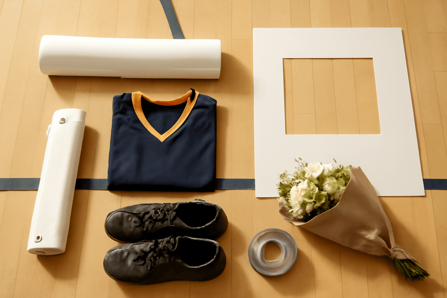
Senior night is a strange design brief. You get about ninety seconds on the floor, a parent holding one end, a phone camera thirty feet away, and a poster that then goes on a bedroom wall and stays there for ten years. It has to work at both distances, which is the part most posters get wrong.
This is a list of ten layouts that survive that test, with what each one actually takes to build. It applies to volleyball, soccer, football, basketball, cheer, cross country, swim — the sport changes the photos, not the layout.
Three things to settle before you open Canva #
Skipping these is how a good design turns into a blurry poster nobody can read from row six.
- Pick the size first, not last. Set the page size in Canva before you place a single photo. Resizing a finished layout stretches everything in it, and Canva's Resize feature is a Pro tool anyway.
- Letter height beats font choice. One inch of letter height per ten feet of viewing distance. Far-side bleachers are 40 to 60 feet, so the name wants 4 to 6 inch letters. Nothing else on the poster needs to be that big.
- Check what your photos can actually carry. A modern phone photo is around 4000 pixels wide, which is a genuinely sharp 13-inch print at 300 DPI. Blown up to fill a 24-inch panel it drops to about 165 DPI — still completely fine on a poster seen from ten feet, but not fine if you crop into a corner of it first. Our DPI explainer covers when the number matters and when it does not.
What Canva already gives you for free #
Worth saying plainly before any app gets mentioned: Canva has thousands of free sports and senior poster templates, free Frames and Grids, free custom page sizes in inches, and free PDF Print export. A template plus four good photos is a perfectly good senior night poster. If the game is Friday, open a template and go — nobody in the gym is going to audit your masking technique.
The apps below are for the handful of things Canva's built-in tools genuinely cannot do: filling each letter of a name with a different photo, turning a jersey or ball outline into a real frame, and generating a parametric arch or grid at an exact size.
Pick a layout before you pick photos #
Almost every senior night poster is one of three shapes. Choosing yours first tells you how many photos to hunt for, which is the slow part.
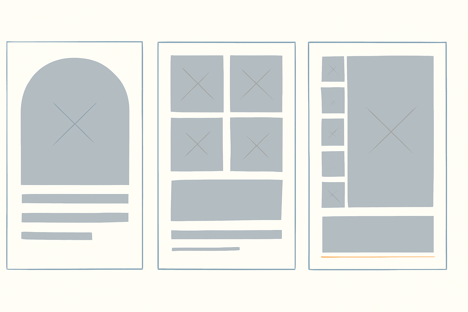
| Layout | Photos needed | Best for |
|---|---|---|
| One hero photo | 1 great action shot | Football, swim, track — sports with one dramatic frame |
| Grid of moments | 4 to 9 | Four-year athletes, team captains |
| Hero plus strip | 1 hero, 3 to 5 small | The safest default; works for every sport |
1. The name filled with four years of photos #
The single most-photographed senior poster idea, and the one Canva cannot do natively. Instead of a name in team colours, each letter of the first name is a window onto a different photo — freshman year in the F, a state meet in the A, and so on.
Text to Frames is built for exactly this. Type the name (up to 200 characters), pick a font, and turn on Split into letters so each character becomes its own real Canva frame rather than one shared mask. Then drag a different photo into each letter and reposition it inside the letterform like any other frame.
Two honest steers. First, use a heavy font. Thin and script faces leave so little interior that the photo reads as noise — of the five fonts open on the free tier (Roboto, Open Sans, Lato, Playfair Display, Pacifico), the first three at bold are the ones that work here; Pacifico will disappoint you. Second, the preview panel in the app is generated the same way as the final output, so what you see there is exactly what lands on the page — if it looks cramped in preview, fix it before adding.
If the name is long, use just the first name or the jersey number. Our piece on photo letters and the step-by-step on filling each letter with a different photo go deeper on font choice.
2. The jersey number as the photo #
Same trick, one character. A number reads from anywhere in the gym, holds a photo far better than letters do because the counters are wide, and it is the thing teammates will actually recognise from across the floor.
Type the number in Text to Frames, or — if you want the number in the school's real jersey typeface rather than a Google Font — save the number as a transparent PNG and run it through Image to Frame instead. That app accepts PNG, SVG or JPG up to 5MB and turns the outline into a working frame.
The one rule that trips everybody: the source has to have a transparent background. Feed it a number on a white square and you get a frame shaped like a square. Canva's Background Remover (a Pro feature) handles this in a click.
3. Freshman to senior, four panels #
Four photos in a row or a 2x2 block, oldest to newest. It is the layout parents cry at, because the story tells itself without a caption.
Build the grid with Frames Lab in Grid mode, where you set columns, rows, the gap between cells, rounded corners and a border colour, and the whole grid drops in as linked frames you fill by dragging. One thing to know: the frame scales itself to fit the page that is currently open, so set your poster size first or you will get a grid built for the wrong canvas. Grids past roughly 30 cells get blocked — not a problem here, but worth knowing if you get ambitious.
Order matters more than styling. Left to right, or top to bottom, chronological. Mixed-up chronology reads as a random collage, which is a fine thing to make but a different thing — see what a photo collage actually is if that is the direction you want.
4. The arch #
A single portrait in an arched frame, name underneath, generous empty space. It is the most restrained option on this list and it photographs beautifully, because the shape does the work instead of the layout.
Frames Lab has an Arc mode with two controls: Pill, the size of the arc in degrees, and Start, where it begins. A 180-degree arc gives you the classic tombstone arch; nudge it and you get a softer dome. Add a thin border in the school's accent colour and stop there.
This is also the layout to choose when you only have one good photo. Everybody has one good photo.
5. The sport-shaped cutout #
A photo cut into the silhouette of a jersey, a ball, a helmet, a cheer bow, a swim cap. Slightly kitsch, extremely popular, and the thing people stop to look at.
You need a black-on-transparent silhouette first, then convert it to a frame. Here is that pair — the raw silhouette on the left, the working frame on the right:
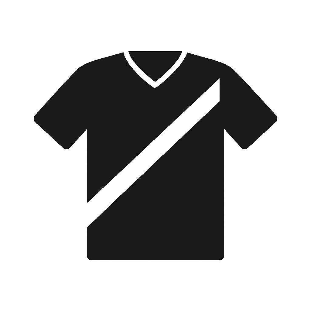

Two routes to the silhouette. Upload one you already have into Image to Frame, or describe the shape in words and let AI Frames draw it — that app also carries a large library of ready-made frames if you would rather browse than prompt.
Keep the outline simple. Very intricate shapes — a full mascot illustration, a spray of confetti — can fail to convert, and the app will suggest picking something cleaner or pulling a ready-made shape from its Frame Store. A jersey, a ball, a bow: fine. A detailed eagle: probably not.
Also note the border on a converted frame only renders once you have actually clicked Add frame to design — it does not show in the preview, which makes people think it is broken. If frames are misbehaving generally, our frame troubleshooting list covers the usual suspects.
6. The stat sheet #
No masking, no shapes. Big name, one photo, and a clean block of numbers: years on varsity, position, captain, records, the college. Set in one strong typeface, well-spaced, nothing else.
This gets included because it is genuinely the right answer sometimes — for a senior whose contribution is measurable, a wall of numbers hits harder than a photo montage. It is also the fastest poster on this list by a distance, which matters when you are making eleven of them the night before.
7. The team-colour border #
A repeating edge of small icons — volleyballs, paw prints, stars, tiny team logos — running around the poster. It frames the content and, more practically, it fills space when you only have three usable photos.
Border Art Maker builds these from repeated dots, icons or images and distributes them evenly on its own, with spacing and rotation controls. Be clear on what it is: it decorates an edge, it does not cut one. If you want the photo itself cut into a shape, that is Image to Frame from idea 5.
8. The photo strip down the side #
Four small square photos stacked in a vertical strip beside one large hero image — the photo booth arrangement, borrowed. It works because your eye reads the big picture first and then walks down the small ones, which is exactly the order you want.
Frames Lab Grid with one column and four rows gives you the strip in one go. Our photo strip walkthrough has the spacing details if you want the authentic booth look with the thick white gutters.
9. Use the back #
Nobody does this and it costs nothing. The front is for the gym; the back is for the athlete. A letter from parents, notes from teammates, a printed group text — whatever it is, it turns a prop into something that gets kept rather than leaned behind a door.
In Canva this is just page 2 of the same design. Print double-sided on foam board, or print page 2 separately and spray-mount it to the back of the board.
10. The digital twin #
The poster gets photographed and posted anyway, so build the crop rather than letting Instagram choose it. Duplicate the design at 1080 x 1350 for a feed post and again at 16:9 if the school runs a scoreboard or pre-game slideshow.
Design the poster so the important half survives a square crop — name and hero photo in the upper two thirds, stats and thank-yous below the fold. That one decision is why some senior night posts look composed and others look like a photo of a poster.
Print sizes worth knowing #
| Format | Typical size | Notes |
|---|---|---|
| School poster board | 22 x 28 in | Cheapest, floppy — mount it or it curls on camera |
| Foam board | 20 x 30 in | Rigid, holds up for the whole walk, photographs flat |
| Printed poster | 24 x 36 in | The one that looks professional in the tunnel shot |
| Vinyl banner | 3 x 5 ft | Grommets, outdoor fence, survives a season |
| Instagram post | 1080 x 1350 px | Design it deliberately, do not let the crop happen to you |
If your print shop wants a size larger than Canva will accept as a custom page, design at half scale and tell them to print at 200 percent — the maths on DPI works out identically. Before you export, check bleed and trim so the border does not get shaved off, and if the shop asks about finish, matte versus glossy matters more than you would think under gym lights — glossy under fluorescent panels is a glare problem.
Five ways these go wrong #
- The name is too small. It is the only thing that has to read from across the gym. Measure it against the ten-feet-per-inch rule before you print.
- Nine photos where four would do. Every photo you add shrinks the others. Four good ones beat nine mediocre ones every time.
- A screenshot as the hero image. Screenshots off a phone gallery, cropped from a group text, are typically a few hundred pixels wide. They look fine on the phone and terrible at 24 inches.
- Team colours at full saturation, everywhere. Pick one as the accent and let white or a neutral carry the rest. Two full-strength colours fighting on one poster is what makes a design look homemade.
- Printing at the last minute. Same-day poster printing exists but the good paper is usually a two-day turnaround. Build the file a week out.
The one that gets kept #
If you only take one thing from this list: the poster is going to be photographed and it is going to be kept. Design for the wall it ends up on, not just the ninety seconds on the floor. That usually means one fewer photo, a bigger name, and more empty space than feels comfortable while you are making it.
For a broader look at what else Canva can and cannot do on large-format work, see our best Canva apps for posters and flyers, and if you are doing this for a whole roster, the Canva apps for teachers roundup covers the batch-production side.
Frequently asked questions
The two most common are 22 x 28 inches (standard school poster board, cheap and easy to carry) and 24 x 36 inches (a printed poster, the size that photographs well in the tunnel shot). If it is going on an outdoor fence for a season, switch to a 3 x 5 foot vinyl banner with grommets instead. Set the page size in Canva before you design anything, because resizing a finished layout stretches every photo.
A rough rule that holds up well: one inch of letter height for every ten feet of viewing distance. Bleachers on the far side of a gym are usually 40 to 60 feet away, so the athlete's name wants roughly 4 to 6 inch letters. On a 24 x 36 inch poster that is a name running most of the width. Everything else on the poster - stats, college commitment, the thank-you line - is read up close, so it can be much smaller.
No. Canva has thousands of free sports poster templates, free Frames and Grids, free custom page sizes and free PDF Print export, and a template plus four good photos makes a poster nobody will criticise. The Qrdy apps in this article are for the specific things Canva's built-in tools cannot do - filling each letter of a name with a different photo, turning a jersey or ball outline into a real frame, or generating a parametric arch or grid. If senior night is Friday, open a template and go.
Related products


More from QRdy Blog
10 Thanksgiving Design Ideas You Can Make in Canva (Printable Decor, Menus & More)
Ten Thanksgiving projects you can actually design and print at home this year — turkey-shaped photo frames, a "GRATEFUL" photo banner, menu cards, a Friendsgiving invite, a November countdown and more. Each one names the Canva app that does the hard part.
CMYK vs RGB: Which Color Mode Should You Use (and What Canva Actually Does)
RGB is light, CMYK is ink — and that one difference is why your print came back duller than the screen. Here's the plain-English comparison, plus exactly what to do about it inside Canva.
The Best Canva Apps for Photo Books & Photo Albums (2026)
A photo book is 40 pages of the same three layouts unless you give yourself better tools. These are the Canva apps that actually speed up building a photo book or album — grid spreads, custom-shape pages, a photo-filled cover — plus what Canva already does well on its own.