
Matte vs Glossy Photo Prints: Which Finish Should You Actually Choose?
Glossy looks better in your hand. Matte looks better on your wall. Here is the honest breakdown of matte, glossy, satin and lustre finishes — what each one does to colour, glare and fingerprints, and which one to pick for framed prints, albums, cards and photo booth strips.
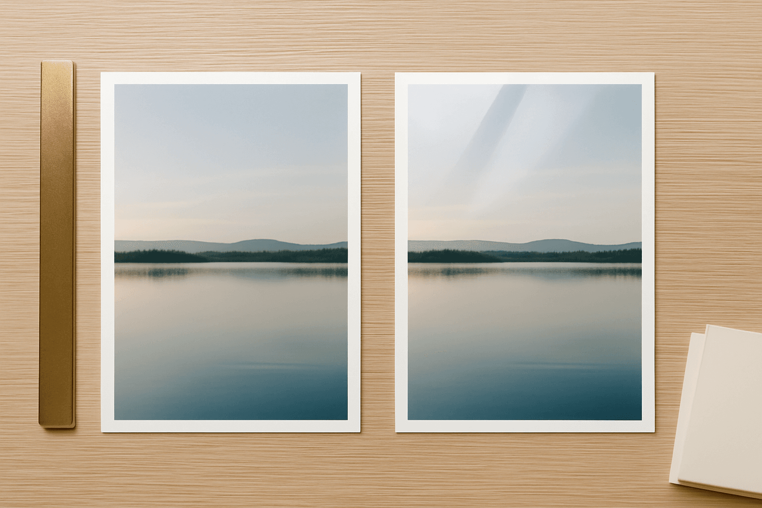
Every print shop asks the same question at checkout, usually right after you have stopped paying attention: matte or glossy? It sounds cosmetic. It is not. The finish decides how much glare the print throws, how punchy the colours look, whether fingerprints show, and whether the thing is still readable once it is behind glass on a wall.
Here is the short version, then the reasoning.
The verdict: choose glossy for prints people hold and look at up close — photo albums, small keepsakes, product shots. Choose matte for anything that goes on a wall, into a frame, or gets handled by a lot of hands. When you cannot decide, satin or lustre is the middle option and it is the one most professional photographers quietly default to.
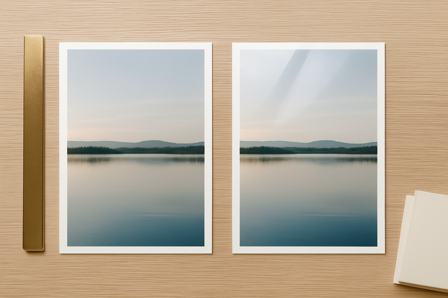
The quick comparison #
| Matte | Glossy | Satin / Lustre | |
|---|---|---|---|
| Colour and contrast | Softer, slightly flatter | Deepest blacks, most saturated | Close to glossy, slightly restrained |
| Glare | Almost none | Heavy under any direct light | Mild |
| Fingerprints | Effectively invisible | Show badly and smear when wiped | Barely visible |
| Behind glass | Excellent | Poor — doubled reflections | Good |
| Fine detail | Very slightly softened | Sharpest apparent detail | Sharp |
| Scratches | Hides them | Shows them | Hides most |
| Writing on the back | Takes pen easily | Pen beads and smudges | Usually fine |
| Typical use | Wall art, framed prints, cards handled by guests | Albums, keepsakes, product photos | Portraits, event prints, anything mixed |
What the finish actually is #
A photo print is paper plus a coating. The coating is what you are choosing between.
Glossy has a smooth, sealed surface that reflects light in one direction, the same way a mirror does. That is why glossy blacks look so deep — light hits the ink and bounces straight back at your eye instead of scattering. It is also why a window across the room turns half the print into a white rectangle.
Matte has a microscopically rough surface that scatters light in every direction. Nothing bounces back in a single beam, so there is no glare, but there is also no mirror-like depth. Blacks read closer to very dark grey and fine detail loses a fraction of its apparent bite.
Satin, lustre, pearl and semi-gloss are all names for coatings that sit between the two. They differ slightly between manufacturers, and no two labs mean quite the same thing by "lustre", but the behaviour is consistent: most of the colour depth of glossy, most of the glare tolerance of matte.
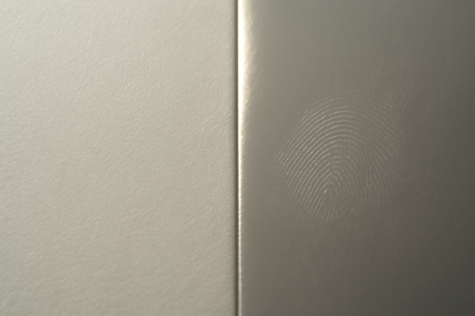
That fingerprint on the right is the part people underestimate. On glossy stock, the oil from one thumb leaves a mark you can see from across the room, and wiping it with a sleeve spreads it into a wider haze. On matte, the same thumb leaves nothing you would ever notice.
The framing problem nobody mentions #
This is the single most common finish mistake, and it is expensive because you usually discover it after the print is already mounted.
Glass is reflective. A glossy print is reflective. Put them together and you get two reflective layers a few millimetres apart, which produces a doubled, offset glare — not just a bright patch but a bright patch with a ghost of itself beside it. In a normal room with a window or a ceiling light, that glare covers enough of the picture that you have to stand at an angle to see the photo at all.
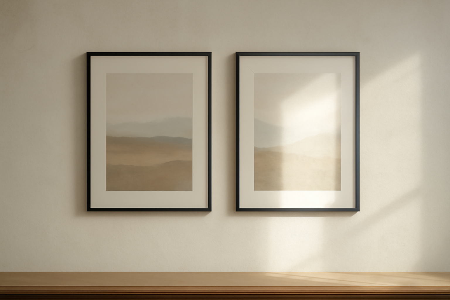
Matte behind glass has none of this. The glass still reflects, but the print underneath does not add a second layer, so the image stays readable from almost anywhere in the room.
The exception is museum or anti-reflective glass, which is coated to kill reflections and costs a good deal more than standard glass. If you are paying for that, a glossy print behind it is fine — the glass is doing the job.
Picking by what you are actually making #
- Wall art and gallery walls — matte. You are hanging it opposite something bright, guaranteed. If you are planning a set, our gallery wall ideas post covers the layout side.
- Photo albums and books — glossy or satin. Nobody is standing across the room from an album, and the pages lie flat under controlled light where glossy's colour depth wins.
- Photo booth strips and party prints — matte or satin. These get passed hand to hand all night. See how to make a photo strip in Canva for the layout.
- Greeting cards, invitations, place cards — matte, and it is not close. Guests hold them, and many cards get written on. Pen does not reliably take on a glossy coating.
- Calendars — matte or satin. A calendar hangs on a wall and gets written on, which is both arguments for matte at once.
- Product photos and portfolio prints — glossy. Maximum saturation, viewed up close, handled with care.
- Stickers and labels — this is a separate decision driven by durability rather than looks, and it is covered in how to make stickers in Canva.
- Anything going into an office or a shop window — matte. Fluorescent ceiling panels are the worst glare source there is.
What this means before you export #
The finish is a paper choice, not a file setting — there is no "matte" checkbox in your design tool. But two things in the file are worth adjusting.
Matte paper absorbs a little more ink and returns a slightly flatter image than the same file on glossy. If your design leans on deep blacks or subtle shadow gradients, push the contrast up a touch before exporting, or step up to satin. It is a small difference, but on a large print it is visible.
Everything else stays the same regardless of finish. Export at 300 DPI at final print size — what DPI actually means if that number is new to you — and set your bleed before you start, not after, which is covered in what is bleed in printing. Neither of those changes because you picked matte.
Designing the print itself in Canva #
Finish decides how a print reads in a room. Composition decides whether it is worth printing at all, and that part happens before the paper choice.
Canva's own tools cover a lot of this for free — Frames and Grids are both free, custom page sizes are free, the bleed toggle is free, and PDF Print export is free. If you need one print by tonight, open a template and go.
Where our apps earn their place is when you want a layout built to a number rather than dragged into position by eye:
- Frames Lab builds frames to parameters — a grid with a set number of columns, rows and gap, an arc with a specific degree value, a diagonal at a chosen angle. Two gotchas worth knowing: the frame scales to fit the page that is currently open, so set your print size first, and grids past roughly 30 cells are blocked, so a very dense collage needs to be two grids stacked.
- Image to Frame turns a PNG, SVG or JPG up to 5 MB into a real Canva frame shaped like that image, so a photo can sit inside a logo, a letter or a silhouette. The source has to have a transparent background or you will get a rectangle — Canva's own Background Remover handles that, on Pro — and very intricate outlines sometimes fail to convert. The border slider only renders after you add the frame to the design, which looks like a bug and is not. The app is Pro, with a free tier for students and teachers.
- Border Art Maker adds a repeating dotted or icon edge and distributes it evenly. On print, go lighter than looks right on screen. It decorates an edge; it does not cut one.
- Calendar Maker generates the month grid for a wall or desk calendar, which pairs with the matte recommendation above.
If you are collaging several photos into one print, what is a photo collage walks through the layout types, and PNG vs SVG vs JPG explains which file format to feed a frame in the first place.
So which one #
If the print goes on a wall or into a frame, matte. If it goes in an album or a hand, glossy. If it does both, or you are printing a batch and only get one choice, satin.
And if you have a print shop nearby, ask for a sample of each in the same image before you commit to a run of fifty. Ten minutes of looking at real paper settles this better than any comparison table, including this one.
Frequently asked questions
Matte, almost always. Glass already adds one reflective layer, and a glossy print underneath adds a second — the two together produce a doubled, distracting glare that makes the picture hard to read from most angles in the room. Matte sits flat behind glass and stays legible. The exception is a frame with true anti-reflective or museum glass, where a glossy print can work because the glass is doing the glare control for you.
Matte, by a wide margin. Glossy paper has a smooth sealed coating that holds the oil from a fingerprint as a visible smear, and wiping it usually spreads the mark rather than removing it. Matte paper scatters light, so a fingerprint has nothing to reflect off and effectively disappears. If the print will be passed around a table — photo booth strips, place cards, guest books, kids' handouts — matte or satin saves you the cleanup.
Not the file itself, but be aware that matte paper absorbs slightly more ink and reads a little flatter and lighter than the same file on glossy. If your design leans on very dark backgrounds or subtle shadow detail, nudge the contrast up before you export, or pick satin instead. Resolution and bleed settings do not change with finish: 300 DPI at final print size and a proper bleed margin apply to every paper type.
Related products


More from QRdy Blog

The Best Canva Apps for Business Cards (2026)
Canva's business card templates are genuinely good — so the apps worth installing are the ones that do what a template cannot: a QR you can re-point after printing, a photo panel shaped like your logo, and a palette that holds across both sides.
How to Make a Family Tree in Canva (With Photos, Step by Step)
A practical walkthrough for building a photo family tree in Canva — how to lay out generations, which frame shape to use for each photo, and how to turn any shape (even a hand-drawn tree) into a real Canva frame you can drop photos into.
What Is a Desk Calendar? Formats, Sizes, and How to Make Your Own
A desk calendar is a small calendar built to sit on a desk, not hang on a wall. Here's what counts as one, the four formats (tent, flip, pad, cube), the sizes people actually buy, and how to design your own in Canva instead of buying one.