
The Best Canva Apps for Posters and Flyers (2026)
A poster fails from across the room, not up close. Six Canva apps that fix the parts posters and flyers actually get wrong — the headline, the hero image, the layout grid, the edge, the palette — plus the print sizes and settings nobody tells you about.
A poster is judged from four metres away, and a flyer is judged in the two seconds before someone decides whether to keep it or bin it. Neither of those moments has anything to do with how much information you managed to fit on the page.
That is why most poster advice is useless. "Use hierarchy" is true and unhelpful. The practical questions are narrower: how do I make the headline the loudest thing on the page without making it ugly, how do I get the hero image into a shape that isn't a rectangle, how do I line up eight photos without eyeballing every gap, and what do I actually export so the print shop doesn't send it back.
These six Canva apps each answer one of those. None of them is a poster template — they are the parts you drop into a poster you are building yourself.
Quick pick #
| App | Best for | Free tier |
|---|---|---|
| Text to Frames | A headline with photographs inside the letters | 5 fonts free, effects Pro |
| Image to Frame | Hero photo cut to a logo, badge or custom shape | App is Pro |
| Frames Lab | Grid, arch and diagonal photo layouts built to a spec | Limited free adds |
| Border Art Maker | A repeating decorative edge around the page | Free to try |
| Color Harmony | One palette across a whole series of flyers | Free to try |
| Bulk QR | Ticket, RSVP or menu codes on a print run | Free to try |
What Canva already does well #
Worth saying plainly before anything else: Canva has thousands of free poster and flyer templates, and they are good. If your event is on Friday, open one, swap the photo, change the date, export. You will be finished before you would have finished reading this page, and nobody at the event will know.
Canva also gives you, free: custom page sizes in millimetres or inches, built-in Frames and Grids in the Elements panel, a bleed setting under File, and PDF Print export. That is the entire technical foundation of print design, at no cost.
The apps below are for the other case — when you have a specific picture in your head, the template library does not have it, and building it by hand means an afternoon of nudging.
1. Text to Frames — the headline that does the work #
On a poster, the headline is not a label. It is the image. And the fastest way to make one word carry an entire design is to fill its letters with photographs.
Text to Frames does this by turning each character you type into a real Canva frame. Not a picture of text, not a PNG — an actual frame, the same kind Canva uses for profile photos and rounded images. So once it is on the page you drag a photo in, then drag the photo around inside the letter until the part you want is showing, exactly as you would with any other frame.
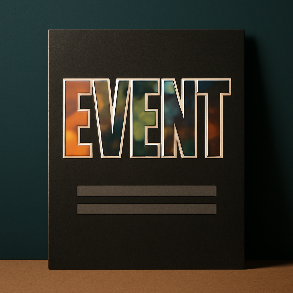
How it works: type your text into the Text box (200 characters maximum — longer and the app tells you "Text is too long"), pick a font, then set letter spacing anywhere from -100 to 100. The setting that matters most is Split into letters. Leave it off and one image flows through the whole word. Turn it on and every character becomes its own separate frame, so a five-letter word can hold five different photographs. The preview at the top updates about half a second after each change, and what the preview shows is exactly what gets added — it is generated the same way as the final output.
Two rules decide whether this looks professional or amateur:
- Use a heavy font. A photograph needs surface area to read as a photograph. In a thin or condensed face you get texture, not an image. The free tier gives you Roboto, Open Sans, Lato, Playfair Display and Pacifico; the Pro tier unlocks the other 100-plus, including the genuinely heavy display faces. If the B and I buttons are greyed out, the font simply has no real bold or italic cut and the app is refusing to fake one.
- Turn on Border. This is the Pro effect that rescues photo-filled type. A headline sitting on a busy poster background sinks into it; a border of 0 to 50 with a colour of your choosing draws a crisp outline along every letter stroke and lifts the word off the page. There are two other effects — Blur (0 to 20) for a glow behind the letters, and Inner shadow (0 to 40) for depth — but at poster scale Border is the one that earns its keep.
Where it stops: some Canva design types refuse frames entirely, and you will see "Frames can't be added to this design type". Posters and presentations are fine; if you hit it, you are in a design type that does not accept frames and the fix is to build in a different one. The frame also scales down to fit your page but never scales up, so start from a page that is already poster-sized.
2. Image to Frame — the hero image in a shape that isn't a rectangle #
The second-loudest thing on a poster is usually one photograph. Putting it in a rectangle is fine. Putting it inside your logo, a badge outline, a leaf, a coffee cup or a house silhouette is what makes people look twice.
Image to Frame takes a PNG, SVG or JPG up to 5 MB and converts it into a Canva frame with that outline, which you then fill with any photo or video. There are three ways to feed it a shape: upload a file, select an image already sitting on your canvas, or use Export design to flatten several elements on one page into a single transparent PNG and convert that — useful when your shape is built from a circle plus a square plus a line rather than being one file.
The one thing that decides whether this works: your source must have a transparent background. If it still has a white or coloured backdrop, the app has no outline to follow and you get a rectangle. Remove the background first — Canva's own Background Remover does this well, and it is Canva's feature, not ours. Simple line shapes convert cleanly; very intricate tangled outlines sometimes fail to convert at all, and the app will suggest a different file or the Frame Store.
One behaviour that looks like a bug and isn't: the border thickness (0 to 50) and border colour you set do not appear in the preview. They render only after you press Add frame to design. That is expected.
Where it stops: the app is Pro, and so is the Frame Store. There is a free tier for students and teachers.
3. Frames Lab — layouts built to a number, not to your eye #
A lineup poster, a market-stall flyer, a class photo sheet — anything with more than about four images — is where hand-placing falls apart. Gaps drift. One column ends up two pixels narrower. Nobody can say why it looks wrong, but it does.
Frames Lab builds those layouts from parameters instead. It opens on three tabs: Create for building, Explore for picking a ready-made frame collection, and Style for reapplying effects to something you already added. Inside Create there are five modes, and three of them matter for posters.
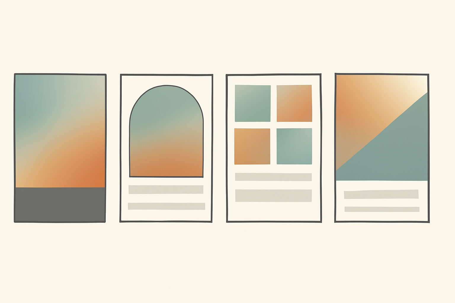
- Grid is the lineup. Set columns, rows and the gap between cells, then use Advanced for rounded corners, a straight border, or merging cells into one block — that merge is how you get one large hero panel sitting inside an otherwise even grid. There is a Wave control that curves the grid lines if you want the layout to feel less rigid.
- Arc is the panel shape that has quietly taken over event posters. Pill sets how much of the circle the arch covers in degrees, and Start sets the angle it begins at. A 270-degree pill with the right start angle gives you the tall arched photo panel at the top of the page.
- Diagonal is the sports and music-flyer layout — slanted photo strips instead of straight ones, with controls for strip spacing, gap and angle. Around 20 degrees reads as deliberate; much more and it reads as a mistake.
Two things to know before you start. Frames scale to fit whatever page is currently open, so set your poster size first or you will build a beautiful grid at the wrong dimensions. And grids past roughly 30 cells get blocked as too complex — a 40-portrait poster is two grids stacked, not one.
Where it stops: free accounts have a cap on how many frames they can add before an upgrade prompt appears.
4. Border Art Maker — the edge #
A decorative border is the cheapest way to make a flyer look designed rather than assembled, and it is the single most tedious thing to build by hand. Duplicating one small icon forty times around a page and getting the spacing even is a genuinely miserable twenty minutes.
Border Art Maker distributes the elements for you. You pick what repeats — dots, one of its built-in icons (stars, hearts, flowers, geometric shapes), or an image you upload — and it spaces them evenly along the path, with controls for spacing and for rotating each element to create a rhythm rather than a row of identical stamps.
One print-specific note: a border that looks tasteful on a bright screen usually prints heavier than you expect, especially on uncoated stock. Go lighter than looks right on the monitor.
Where it stops: it decorates an edge, it does not cut one. If you want the photograph itself to be shaped, that is Image to Frame or Frames Lab.
5. Color Harmony — the pick that saves a series #
One poster does not need this. Six posters for the same festival, or a monthly flyer that has to look like last month's, absolutely does.
Color Harmony generates palettes from colour theory rather than guesswork — complementary, analogous, triadic, tetradic, split-complementary, monochromatic. You choose a base colour with the picker or by typing a HEX value, and it returns the sets that actually work with it. You can save a palette as a brand set and reuse it, and because it hooks into Canva's Apply colors to page, recolouring an entire layout is one click rather than forty selections.
The practical value is consistency across a run. Pick the palette before you build poster number two, not after poster number five has gone to print in a slightly different blue.
6. Bulk QR — when the flyer has to do something #
A flyer that only tells people about an event is doing half a job. A flyer with a code that opens the ticket page, the RSVP form, the menu or the WiFi is doing all of it.
Bulk QR generates codes in batches from a list, covering links, plain text, email, SMS, WiFi credentials and contact cards, and it can also read a code back out of an image if you have inherited artwork and need to know where it points. That batch behaviour is the reason to use it for print — twelve venue posters each pointing at a different room, or a market run where every stall gets its own code, is a list, not twelve separate jobs.
Test one printed code with a real phone at the real distance before you print the other 499. Codes that scan perfectly on screen can fail on paper if they end up too small or sit on a busy photo. If you want the full picture on QR in Canva, including what changed this year, we covered it in how to make a QR code in Canva.
Poster and flyer sizes #
Set this before you design anything. Canva's Resize is a Pro feature, so changing your page size later is not a two-second fix.
| Format | Size | Typically used for |
|---|---|---|
| A2 poster | 420 x 594 mm (16.5 x 23.4 in) | Street and venue posters |
| A3 poster | 297 x 420 mm (11.7 x 16.5 in) | Shop windows, noticeboards |
| Tabloid poster | 11 x 17 in | US equivalent of A3 |
| A4 / Letter flyer | 210 x 297 mm / 8.5 x 11 in | Handouts, one per sheet |
| A5 flyer | 148 x 210 mm (5.8 x 8.3 in) | Two per A4 sheet |
| DL flyer | 99 x 210 mm (3.9 x 8.3 in) | Three per A4, fits a standard envelope |
Print settings that decide whether it looks professional #
- Download as PDF Print, not PDF Standard. PDF Print exports at 300 DPI; PDF Standard exports at screen resolution and will look soft on paper. More on what that number actually means in what is DPI.
- Add bleed if any colour, photo or border touches the edge of the page. Canva has a bleed toggle under File, and without it a full-bleed poster will come back with a thin white line down one side. See what is bleed in printing.
- Keep important text at least 5 mm inside the trim line. Guillotines drift, home printers drift more.
- Check the photo at 100 percent zoom, not the 25 percent you designed at. A hero image that looks sharp on the fitted view can be badly under-resolution at A2.
- Print one at actual size and pin it up before you order 500. Read it from across the room. If the headline does not survive that, nothing else on the page matters.
Which app for which job #
| The problem | The app |
|---|---|
| Headline needs to be the image | Text to Frames |
| Each letter should hold a different photo | Text to Frames with Split into letters |
| Hero photo in a logo or custom silhouette | Image to Frame |
| Even grid of 6 to 30 photos | Frames Lab, Grid mode |
| Arched photo panel at the top | Frames Lab, Arc mode |
| Slanted strips for a sports or gig flyer | Frames Lab, Diagonal mode |
| Repeating decorative edge | Border Art Maker |
| Same palette across a whole series | Color Harmony |
| A code per venue, stall or event | Bulk QR |
| You need it finished tonight | A Canva template |
Start with the headline #
If you take one thing from this: build the headline first, at full size, and look at it before you add anything else. Posters are not assembled from the top down — they are built around the one element that has to survive being seen from four metres away in bad light. Everything else on the page is support.
Print it. Pin it up. Walk to the other side of the room. That test costs one sheet of paper and tells you more than another hour of nudging ever will.
Related reading #
- What is knockout text? — the concept behind photo-filled headlines
- What are photo letters? — ideas and examples
- What is aspect ratio? — why hero images crop badly
- PNG vs SVG vs JPG in Canva — which file to feed a frame app
- The best Canva apps for small businesses — the wider marketing toolkit
Frequently asked questions
For a shop window or noticeboard, A3 (297 x 420 mm / 11.7 x 16.5 in) is the workhorse. For a street or event poster, go A2 (420 x 594 mm). For handouts, A5 (148 x 210 mm) gets two per A4 sheet and a DL flyer (99 x 210 mm) gets three. In the US, an 11 x 17 in tabloid poster and an 8.5 x 11 in Letter flyer cover most of the same ground. Set the size before you design anything — Canva's Resize feature is Pro-only, so changing your mind later means rebuilding.
Yes, thousands of them, and they are free. If you need a flyer by tonight, open a template and go — you will finish faster than you would reading this article. The apps below earn their place at two specific points: when you want a headline or hero image in a shape Canva's element library does not have, and when you need a layout built to an exact spec rather than nudged by eye.
A4 and Letter flyers, yes. A3 and larger need a print shop or a wide-format printer. Two things decide whether the result looks professional: download as PDF Print rather than PDF Standard, and add bleed if any colour or photo runs to the edge — home printers cannot print edge to edge, so a full-bleed design must be printed oversized and trimmed.
Almost always the font. A photo needs surface area to read as a picture, so a light or condensed typeface leaves you with texture rather than an image. Use the heaviest weight you have, and if the letters still sink into the background, add a border around them — in Text to Frames that is the Border slider (0 to 50) with a colour picker, and it is the single setting that rescues most photo-filled headlines.
Related products


More from QRdy Blog
How to Make a Hat Mockup From a Photo (So the Design Curves With the Cap)
Turn one photo of a blank cap into realistic hat mockups: drag a box around the front panel, let the design wrap the curve with the photo's real shading, then render all your designs at once in your browser.
The Best Canva Apps for Family Reunions (2026): Invites, Banners, Photo Walls and Calendars
Planning a family reunion in Canva? Here are the five Qrdy apps that actually help: shaped photo invitations, photo-letter banners, photo-wall grids, a countdown calendar and a QR link that can change after printing.
How to Make a Birthday Calendar in Canva (Family Birthday Tracker, Step by Step)
Build a printable family birthday calendar in Canva: 12 months, one page each, with names added in minutes. A step-by-step tutorial using Calendar Maker, plus honest notes on what Canva does on its own.