
What Is DPI? 300 vs 72 DPI, and What It Actually Means in Canva
DPI decides whether your printed calendar, photo card or sticker looks crisp or fuzzy. Here's what DPI really means, why 300 DPI is the print standard, the pixel math you need — and exactly where DPI lives in Canva (spoiler: there's no DPI box).
If you have ever downloaded a design from Canva, sent it to a print shop, and been told "this file isn't 300 DPI," you have run into the one print term nobody explains properly.
Here is the short version: DPI is not a quality setting you switch on. It is a ratio between the pixels you already have and the physical size you want to print them at. Once that clicks, most print problems stop being mysterious.
What DPI means #
DPI stands for dots per inch — how many individual dots of ink a printer lays down across one inch of paper. More dots in the same inch means finer detail and smoother edges. Fewer dots means you start to see the softness.
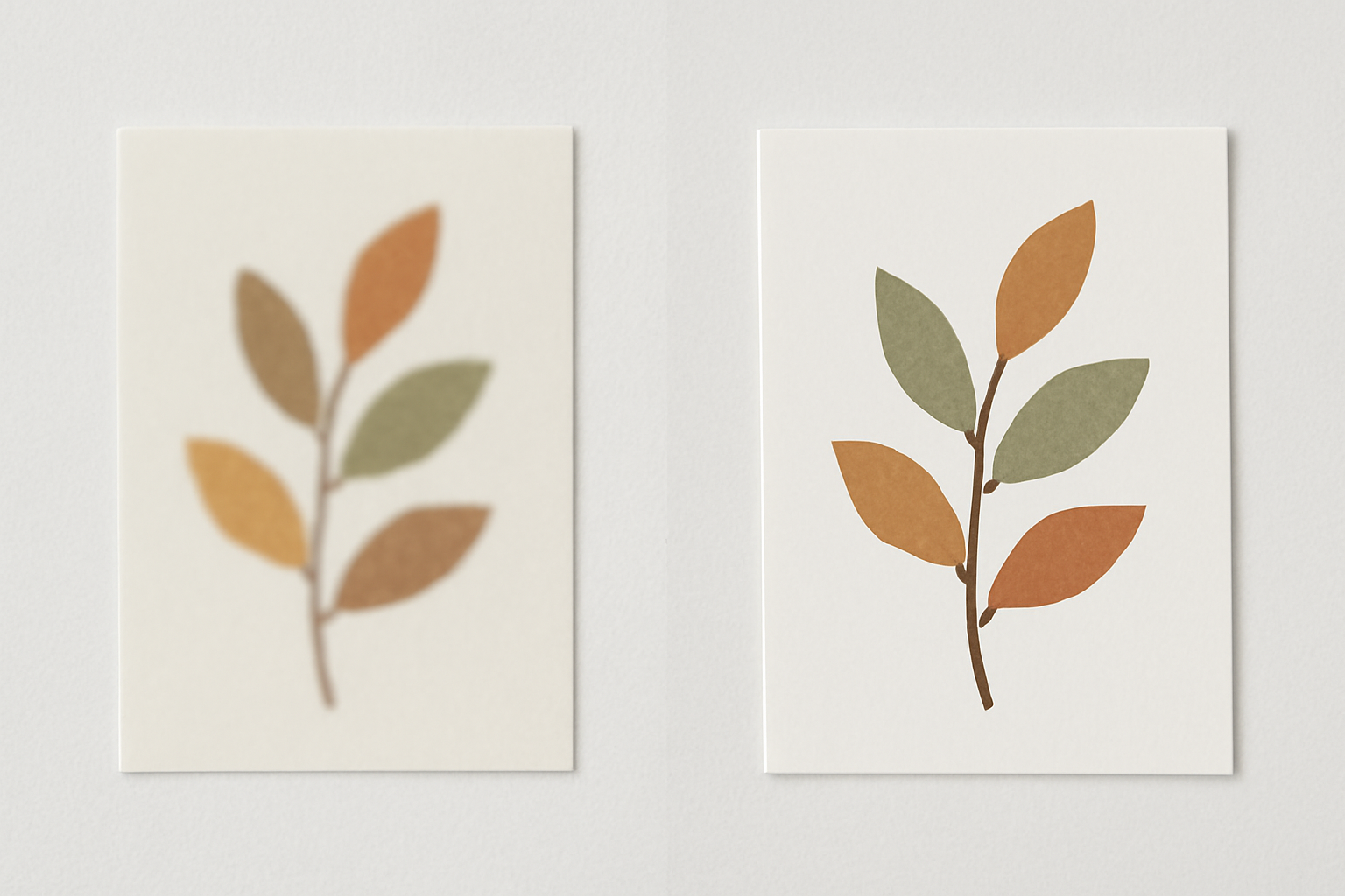
The number describes density, not size. A 300 DPI image is not "bigger" than a 72 DPI image; it packs its detail into a tighter space. Take the exact same photo and print it at two densities:
- At 300 DPI, the dots are small enough that your eye blends them into continuous tone. It looks like a photograph.
- At 72 DPI, the same detail is spread across four times as much paper. Edges look chunky, text looks fuzzy, gradients look banded.
That is the entire concept. Everything else is arithmetic.
DPI vs PPI — the distinction, briefly #
Strictly speaking:
- PPI (pixels per inch) describes an image file — how many pixels of data exist per inch of intended print size.
- DPI (dots per inch) describes a printer — how many ink dots the hardware can physically place per inch.
In everyday design conversation the two are used interchangeably, and when a printer asks for "300 DPI files" they mean 300 PPI images. We use DPI here in that everyday sense, because that is the word you will actually see in Canva, in print shop upload forms, and in your client's email.
The only formula you need #
Pixels ÷ DPI = printed inches. Rearranged: inches × DPI = pixels needed.
That is it. Everything about print resolution falls out of those two lines.
So if you want to print a photo at 5 × 7 inches at 300 DPI, you need 1500 × 2100 pixels. If your photo is only 800 × 1000 px, you can print it at 300 DPI — just not bigger than about 2.7 × 3.3 inches.
Here is the table worth bookmarking:
| Print size | Pixels needed at 300 DPI | Pixels at 150 DPI (acceptable) |
|---|---|---|
| 4 × 6 in photo | 1200 × 1800 | 600 × 900 |
| 5 × 7 in card | 1500 × 2100 | 750 × 1050 |
| 8 × 10 in print | 2400 × 3000 | 1200 × 1500 |
| 8.5 × 11 in (US Letter) | 2550 × 3300 | 1275 × 1650 |
| A4 (8.27 × 11.69 in) | 2480 × 3508 | 1240 × 1754 |
| 11 × 17 in poster | 3300 × 5100 | 1650 × 2550 |
A useful reality check: that 1080 × 1080 px square you exported for Instagram prints at exactly 3.6 × 3.6 inches at 300 DPI. Not a poster. Barely a coaster.
Why 300 DPI became the standard #
300 DPI is roughly where the average person, holding a page at normal reading distance, stops being able to resolve individual dots. Push past it and you are mostly adding file size, not visible quality.
Which means the "right" DPI depends entirely on viewing distance:
| What you're printing | Sensible DPI |
|---|---|
| Photo prints, cards, stickers, planner pages | 300 |
| Calendars, flyers, brochures | 300 |
| Posters viewed from a metre away | 150–200 |
| Large signage, banners | 72–150 |
| Anything on a screen | Irrelevant — only pixels matter |
That last row surprises people. Screens do not have inches, they have pixels. A 1080 × 1080 image looks identical on Instagram whether it is tagged 72 DPI or 300 DPI. The DPI tag simply does nothing until a printer reads it.
The myth: "just change it to 300 DPI" #
This is the single most common misunderstanding, and it costs people reprints.
Opening a small image, typing "300" into a resolution field, and saving does not create detail. If the file has 600 × 400 pixels, it has 600 × 400 pixels. Relabelling it 300 DPI simply tells the printer to render it at 2 × 1.3 inches instead of 8.3 × 5.6 inches. The pixels never changed — only the instruction about how tightly to pack them.
AI upscalers do help a little, but they are guessing at texture that was never captured. They are a rescue tool, not a workflow. The reliable move is to start from a large original.
Where DPI actually lives in Canva #
Here is what trips up most Canva users: there is no DPI box in Canva. People search for it, do not find it, and assume Canva can't do print work. It can — the control is just in two other places.
1. Your canvas size #
Canva measures canvases in pixels under the hood. When you type a size in inches or millimetres, Canva assumes 96 pixels per inch — so an 8.5 × 11 in canvas is really 816 × 1056 px. Print that as-is and you get a 96 DPI page. Soft.
The fix: create your design with a custom size in pixels using the numbers from the table above. Want a print-ready US Letter calendar? Start a 2550 × 3300 px canvas. Now everything you place on it has room to be sharp.
2. Your download type #
This is the one that matters most, and Canva is clear about it in their own documentation:
| Download option | Effective resolution | Use for |
|---|---|---|
| PDF Print | 300 DPI, with bleed, crop marks and CMYK option | Anything going to a printer |
| PDF Standard | 96 DPI | Email, screen viewing |
| PNG | Depends on canvas size; a size multiplier is available on Canva Pro | Digital, or small prints from a big canvas |
| JPG | Same as PNG, plus lossy compression | Screens, photo uploads |
If you take one thing away: choose PDF Print. It is the only Canva export that guarantees professional print resolution.
One honest caveat — PDF Print does not repair bad inputs. If you dropped a 500 px web image into your design, exporting at 300 DPI just prints that blurry image very precisely. Garbage in, high-resolution garbage out.
Keeping things sharp when you build the design #
Where your elements come from matters as much as your export settings.
Text and shapes are effectively resolution-independent. Canva renders native text, lines and shapes as vectors, so they stay crisp at any print size. A calendar grid built from real text elements will print sharp on a huge wall calendar; a screenshot of that same grid will not.
This is why generating design elements beats screenshotting them. Calendar Maker inserts a calendar into your Canva design as live text and shape elements rather than a flattened picture — so you can scale that 2550 × 3300 px canvas up or down and the date numbers stay razor sharp. It also means you can restyle fonts and colours in Canva afterwards without any quality loss, and its Month tab can drop all twelve months onto their own pages in one go for a printable year set.
A few more habits that pay off at print time:
- Feed frames with big photos. A frame only crops — it never adds pixels. If you use Image to Frame to turn a shape into a custom Canva frame, prefer an SVG or a large PNG as your source shape so the frame edge stays clean, and drop full-resolution photos inside it rather than web-sized ones.
- Build collage grids from elements, not screenshots. Apps like Frames Lab generate arc, grid and burst frames as real Canva objects, so a photo wall or collage scales without softening.
- Watch decorative borders. Border Art Maker repeats icons and images around your page — if the source icon is small and low-res, every repetition inherits that softness.
- Check before you print. Zoom to 100% in the exported PDF. What you see there is roughly what the paper will show.
Canva's own Frames, Grids and Print products handle plenty of this on their own, and for a straightforward photo print they are perfectly adequate. The apps above matter when you need a shape, grid or calendar Canva doesn't offer natively — and the resolution rules are exactly the same either way.
The short version #
- DPI = dots per inch. It is a ratio, not a quality switch.
- Pixels ÷ DPI = printed inches. Memorise this and you will never guess again.
- 300 DPI for anything held in the hand; less is fine for anything viewed from further away.
- DPI is meaningless on screens — only pixel dimensions matter there.
- You cannot add detail by relabelling a file 300 DPI.
- In Canva: set your canvas in pixels, and download as PDF Print.
Get those right and "the print looks blurry" stops being a thing that happens to you.
Frequently asked questions
No. 300 DPI is the standard for things held in the hand — photo prints, cards, stickers, planner pages, calendars. For anything viewed from a distance, you can go lower: 150-200 DPI is fine for posters and large signs, and 100 DPI or less is normal for banners and billboards. For screens, DPI is irrelevant entirely; only the pixel dimensions matter.
Not in any way that adds real detail. Changing a file's DPI tag without adding pixels just relabels it — a 600 x 400 px photo tagged as 300 DPI is still 600 x 400 px and will still print at 2 x 1.3 inches before it goes soft. Software that 'upscales' invents plausible pixels rather than recovering lost ones, which can help slightly but is not a substitute for a bigger original.
There isn't one. Canva has no DPI field. You control print resolution in two places instead: the canvas size you start with (in pixels) and the file type you download. Choose PDF Print and Canva exports at 300 DPI; PDF Standard exports at 96 DPI and is meant for screens.
No. Screens display pixels, so only the pixel dimensions of your image affect how sharp it looks online. A 1080 x 1080 px image looks identical on Instagram whether its DPI tag says 72 or 300. DPI only becomes meaningful the moment the file meets a printer.
Related products


More from QRdy Blog
Photoshop Clipping Mask vs Text to Frames: Photo-in-Text in Canva
Filling text with a photo is a classic Photoshop trick. Here is how the Photoshop clipping mask compares with Text to Frames in Canva, and which one fits a quick title or banner.
The Best Canva Apps for Birth Announcements (2026)
Making a birth announcement in Canva? Here are the best Canva apps for it in 2026: custom photo shapes, name lettering, photo grids, borders, and a first-year calendar. Honest picks, with Canva's built-in tools included.
How to Make a Christmas Tree Photo Collage in Canva (Step by Step)
Turn your favorite family photos into a Christmas tree-shaped collage in Canva: two methods (a tree-shaped frame or a stacked grid), exact steps, print sizes, and tips so faces stay visible.