
Digital Planner vs Printable Planner: Which Should You Make in Canva?
A digital planner and a printable planner start from the same Canva pages but split on five decisions: page size, navigation, colour, export, and how you fix a mistake. Here is which one to build, and how to build it without redoing the work twice.
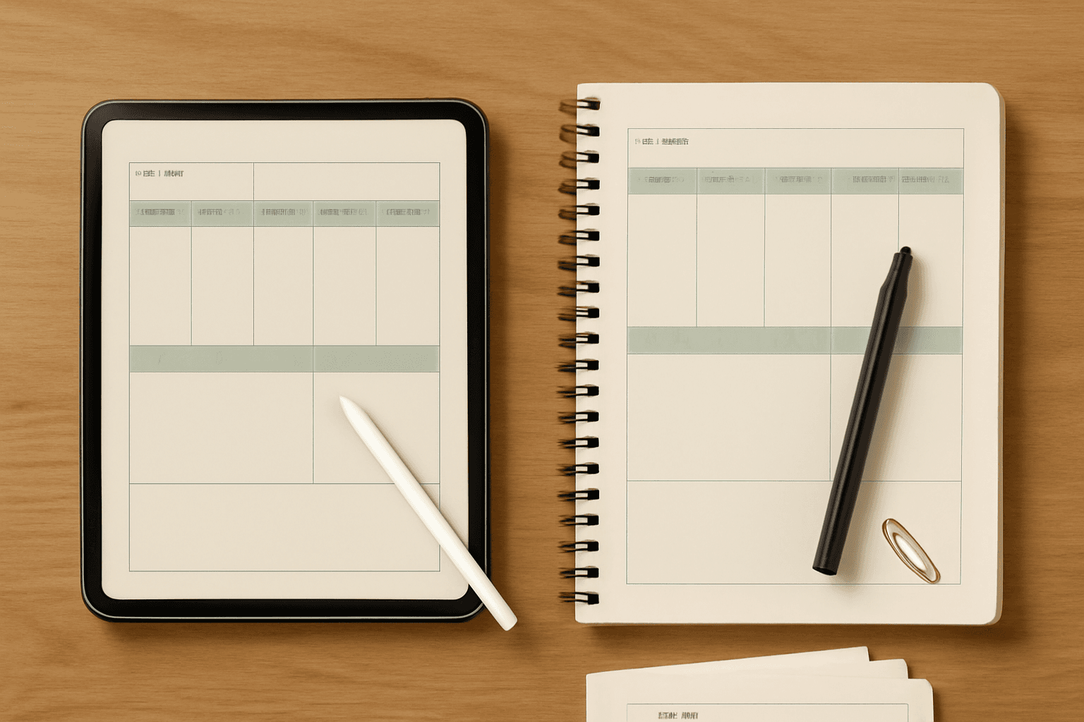
People usually decide between a digital planner and a printable planner on vibes — paper feels nicer, tablets feel tidier — and then discover halfway through the build that the two are not the same document in two file formats. They are two different products that happen to start from the same Canva pages.
The good news: the actual difference comes down to five decisions. Get those right up front and you can build one properly, or build both without doing the work twice.
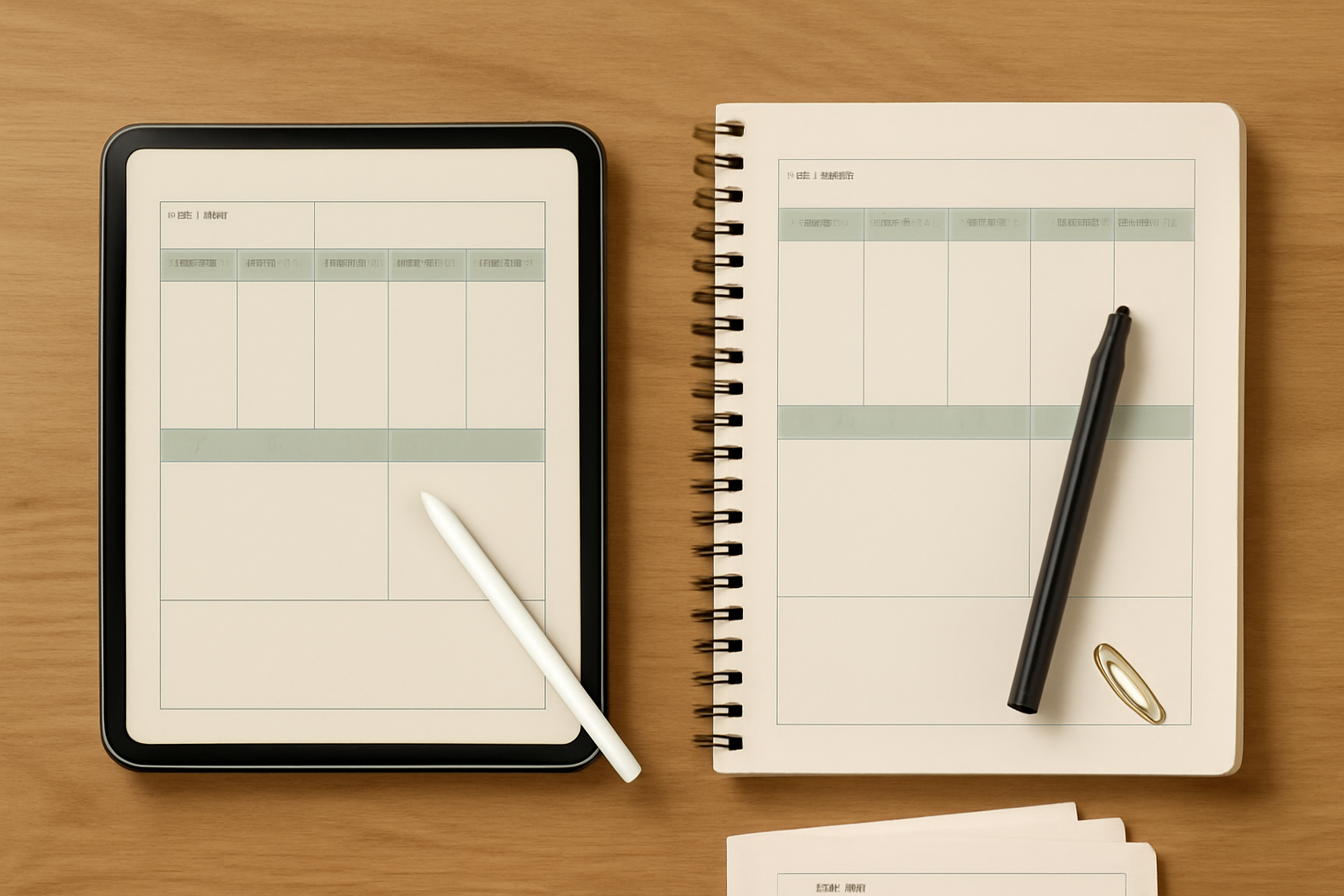
The short answer #
Make a printable planner if you want the thing finished this week, you like writing by hand, you are testing whether a planner layout works before investing in it, or you are selling to an audience that prints and binds.
Make a digital planner if you already annotate on a tablet, you want to jump between months without flipping, you want it to be undo-able and re-usable next year, or you are selling to the GoodNotes/Notability crowd.
Make both only after the printable one exists. Building print-first and adding a digital version is straightforward. Going the other way means re-laying-out every page.
Side by side #
| Printable planner | Digital planner | |
|---|---|---|
| Final file | PDF (or PNG/JPG per page) | PDF only — links break otherwise |
| Page shape | Letter, A4, A5, Half Letter | Your tablet's screen ratio (roughly 4:3 or 16:10, landscape) |
| Navigation | You flip pages | Tapped tabs and hyperlinks |
| Export setting | PDF Print (high resolution, for printing) | PDF Standard is fine — nothing is printed |
| Resolution matters? | Yes — aim for 300 DPI at final size | Not really — it is a screen |
| Colour and ink | Heavy backgrounds cost real money to print | Free; go as saturated as you like |
| Fixing a typo | Reprint the page | Re-download and re-import |
| Reusable next year | No — dates are printed | Only if you rebuild the date pages |
| Build time | Shorter | Longer, because of the linking |
| Best for | Handwriting, kids, walls, binders | Stylus users, travel, searchable notes |
What a "digital planner" actually is #
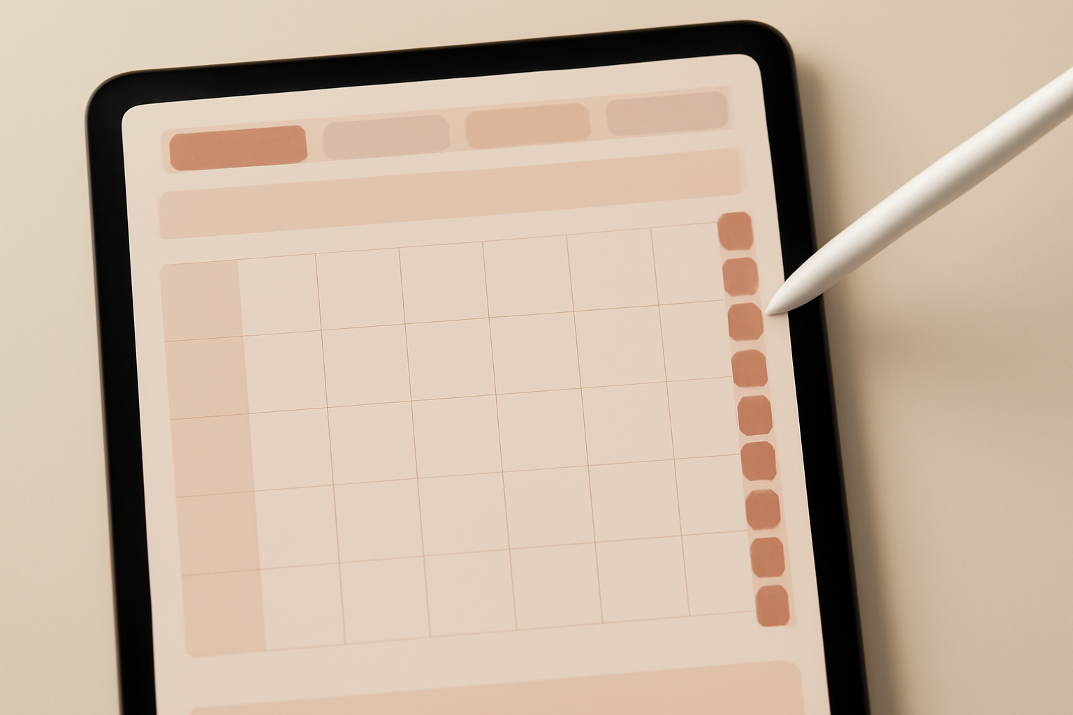
It is less magical than it sounds. A digital planner is a multi-page PDF where certain elements are hyperlinked to other pages in the same file. You open it in an annotation app — GoodNotes, Notability, Noteshelf, or any PDF app that lets you draw on top — and tapping a month tab jumps you to that month.
That is the whole trick. There is no special file format and no app to build it in. Canva can make one because Canva can link an element to a page in the same design.
How to link pages in Canva #
Select the element you want to make tappable, choose More on the toolbar, then Link, and pick the destination from the Pages in this document section of the dropdown. Repeat for every tab. This is the tedious part, and it is the part people skip.
Three rules from Canva's Help Center that will save you an evening:
- Hyperlinks only work on PDF files — and not on flattened PDFs. If you tick the flatten option on export, every link dies silently.
- PNG and JPG do not carry hyperlinks at all, no matter where the image came from.
- Links on text with heavy text effects can stop working. If a tab refuses to respond, strip the effect off the text or put the link on a shape underneath it instead.
A practical habit: build the twelve month tabs once, as a group, on a single page. Link them, then copy that whole group onto every other page. The links travel with the copy, so you link twelve things once instead of twelve times per page.
What a printable planner has to get right instead #
No links to worry about — but paper is unforgiving in other ways.
Margins and the binding edge. If the pages go into a ring binder or get spiral-bound, the inside edge disappears. Leave around 15 mm of dead space there, and keep every writing line clear of it. A weekly layout that runs edge to edge looks great on screen and loses Monday in the binding.
Resolution. Export via PDF Print, which is Canva's high-resolution print download, rather than PDF Standard, which is sized for screens. If you are unsure what that actually means for sharpness, we broke it down in What Is DPI? — the short version is that 300 DPI is a ratio between pixels and inches, not a quality switch you flip at the end.
Ink. A dark header band across every page looks confident in the editor and costs a fortune from a home printer. Soft alternating row shading reads just as clearly and uses a fraction of the toner. If you are selling the file, buyers notice this and mention it in reviews.
The part both versions share: the grid itself #
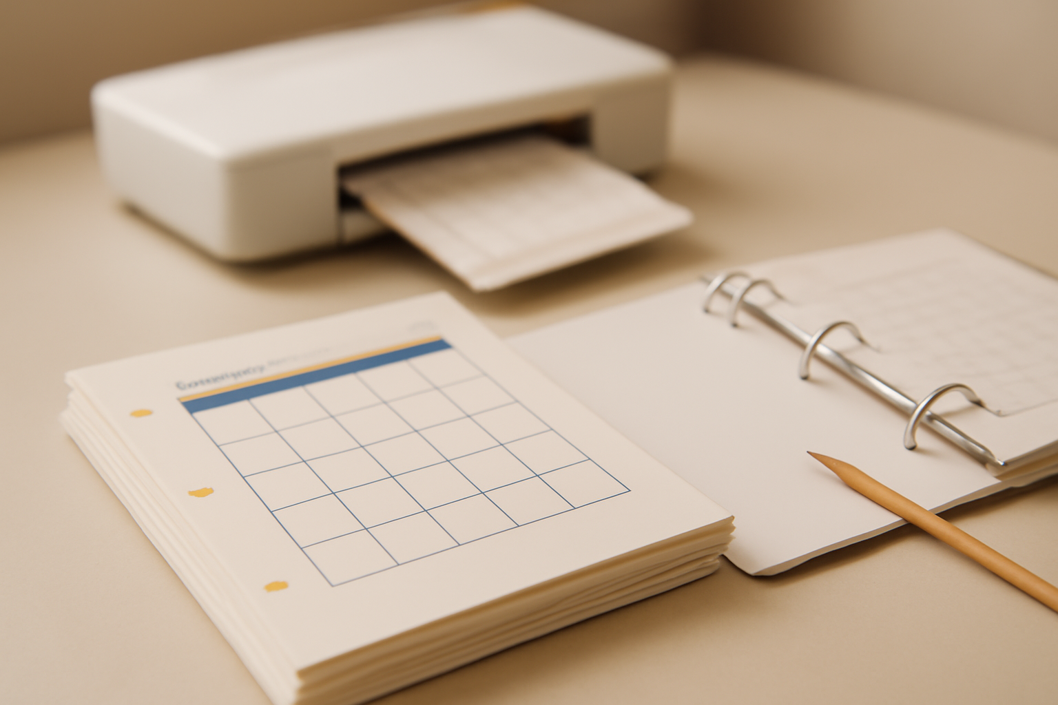
Whichever route you pick, the slow work is the same — laying out the dates. Twelve monthly grids plus fifty-two weekly spreads is a lot of cells to type, and a single wrong date number in September is the kind of error nobody spots until a customer does.
This is where Calendar Maker earns its place. It is a Canva app that generates the grid and drops it straight into the design you have open, so you never type a date.
It has three tabs, and a planner usually needs two of them:
- Month — the familiar grid. Pick a month and year (anywhere from ten years back to ten years ahead), or tick Add all months to generate the whole year at once. Each month on its own page puts every month on its own page, named "Month - Year", which is exactly the structure a planner PDF needs. Start week with Sunday flips the week for US layouts; the app guesses your default from your language and region.
- Week — a weekday table for the weekly spreads. Choose which days appear, set Number of rows anywhere from 1 to 27 to control how much writing space sits under each day, and turn on Shorten labels to get "Mon" instead of "Monday" when space is tight.
- Custom — any date range up to 150 days, for a term planner, a launch countdown, or a 90-day challenge section.
Styling is shared across all three tabs. You can set the font, bold/italic/underline, alignment, size (1–100) and colour separately for the weekday headers and the date numbers, plus the header bar colour and two alternating row colours. There are over 30 ready-made colour sets in a carousel, and a live preview so you see the result before it lands in your design.
Two features matter more for planners than for a one-off poster:
Page templates. The Month tab includes around 14 decorated page designs — Botanical, Watercolour, Scandi Minimal, Midcentury, Coastal, Vintage Postcard and others. Pick one and the app builds a decorated page with the month and year filled in, then places the calendar on top with colours matched to the theme. Note that if your design size differs from the template's, you may need to nudge a few elements after it lands.
Saved setups. Tick Save settings after adding successfully and each successful insert stores your whole configuration. Each tab keeps its own carousel of roughly the last 30 setups. For a planner this is the difference between a consistent book and a slightly-different-every-page one — you set the style once in August and recall it in November without trying to remember which grey you used.
Calendar Maker has its own Pro tier. Free users see Unlock to use instead of Add to design, and a Restart app button to re-check status after unlocking.
Decorating it without making it unusable #
A few of the other Canva apps we build slot in around the grid, and they behave differently depending on which planner you are making:
- Border Art Maker — repeating dot, icon, or image borders with even spacing and rotation control. Lovely on a digital cover; use a lighter hand on printable pages, where every border is ink.
- Frames Lab — grids, arcs and rounded frames for cover pages, monthly photo headers and divider pages.
- Image to Frame — turns a PNG or SVG shape into a real Canva frame, so a cover photo can sit inside a leaf, arch or wreath instead of a rectangle. Feed it a transparent source or you will get a rectangle back.
- Color Harmony — generates a harmonious palette and applies it across the design. Worth ten minutes at the start of a 60-page planner, because the alternative is discovering three near-identical blues on page 40.
What Canva already does well #
Worth saying plainly: Canva has a large library of editable planner and calendar templates, free ones included. If one of them is close to what you want, use it and skip most of this article. The apps earn their place at two specific points — generating dates you would otherwise type by hand, and making shapes and frames the built-in library does not have.
Canva's own Magic Resize (Pro) is also the cleanest way to produce the second format once the first one exists, and Canva's page linking is a core feature, not an add-on.
The verdict #
If this is your first planner, make it printable. You will finish it, you will find the layout problems by using it, and nothing breaks silently. Print one week, live with it for seven days, and fix what annoys you before you build the other fifty-one.
If you already work on a tablet, make it digital, but budget an extra evening for linking and test the PDF in your actual annotation app before you call it done — not in a browser preview, which will happily show links that a flattened export has already destroyed.
And if you are selling both: build print-first, at print size, with a generous margin, then resize to landscape and add the links. That order costs you one afternoon. The other order costs you the whole layout.
Related reading #
Frequently asked questions
Yes. A digital planner is just a multi-page Canva design with links between pages, downloaded as a PDF. You add a link by selecting an element, choosing More then Link, and picking a page from the "Pages in this document" section. The one hard rule from Canva's Help Center: hyperlinks only work in PDF downloads (and not in flattened PDFs). They do not survive a PNG or JPG export.
Printable is easier for a first project. You do not have to build a navigation system, you do not have to worry about links breaking, and a page that looks slightly off is still perfectly usable on paper. A digital planner is more work up front because every tab has to be linked, and the linking is the part people skip and then regret.
Match your tablet's screen shape rather than a paper size. Most iPads are close to 4:3 in landscape, and many Android tablets are nearer 16:10. If you build on a portrait A4 or Letter canvas, the page will sit in the middle of the tablet screen with grey bars on both sides, which is the single most common giveaway of a paper layout reused digitally.
No, but plan for it. Build the printable version first at print size, keep the layout on a generous margin, then use Canva's Magic Resize (or duplicate the design and re-set the dimensions) to make the landscape digital version and add the links. Doing it in that order is much less painful than shrinking a landscape digital layout onto paper afterwards.
Related products


More from QRdy Blog
How to Make an Arch Photo Frame in Canva (Arch and Rainbow Curved Frames)
Arch and rainbow photo frames are everywhere in nursery art and boho posters. Here is how to make one in Canva step by step, using an arch shape or Frames Lab's Arc mode, with tips for sizing and spacing.
What Is a Bento Grid? Definition, Examples, and How to Make One in Canva
A bento grid is a layout of rounded tiles in mixed sizes, named after the Japanese lunch box. Learn what it is, how it works, and how to build one with photos in Canva.
10 Photo Name Art Ideas You Can Make in Canva (Words Filled with Photos)
Ten photo name art ideas for Canva: names, words and dates where every letter is filled with a different photo. Gifts, banners, posters and more, built with Text to Frames.