
What Is a Tri-Fold Brochure? Panels, Sizes, and How to Make One in Canva
A tri-fold brochure is one sheet folded twice into six panels — and the order those panels sit in on the flat sheet is not the order anyone reads them. Here is what a tri-fold actually is, the standard sizes, and how to lay one out in Canva without printing it backwards.
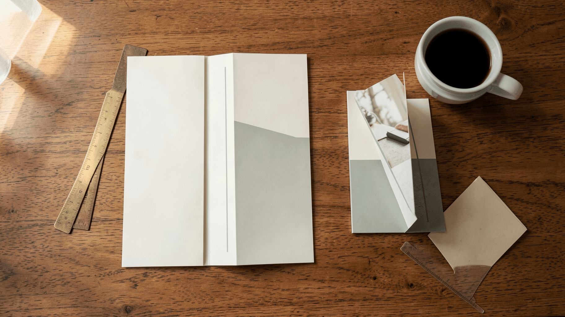
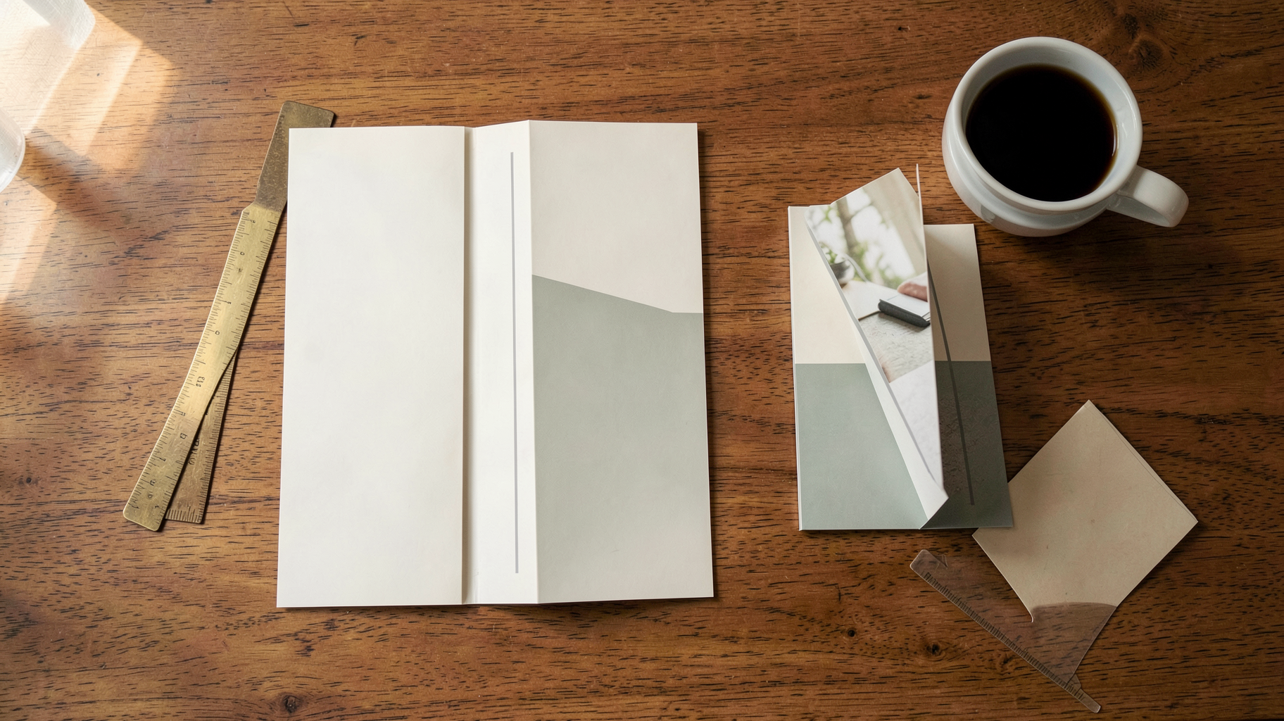
A tri-fold brochure is a single sheet of paper folded twice, along two parallel lines, to create three panels on each side — six panels in total.
That is the whole definition. The reason tri-folds trip people up is everything that follows from it: those six panels do not sit on the flat sheet in the order anyone reads them, one of them should be slightly narrower than the others, and if you lay the file out wrong you will not find out until a box of a thousand of them arrives.
This post covers what a tri-fold actually is, how the panels map, the standard sizes, how it differs from the other folds people confuse it with, and how to lay one out in Canva.
What a tri-fold brochure is #
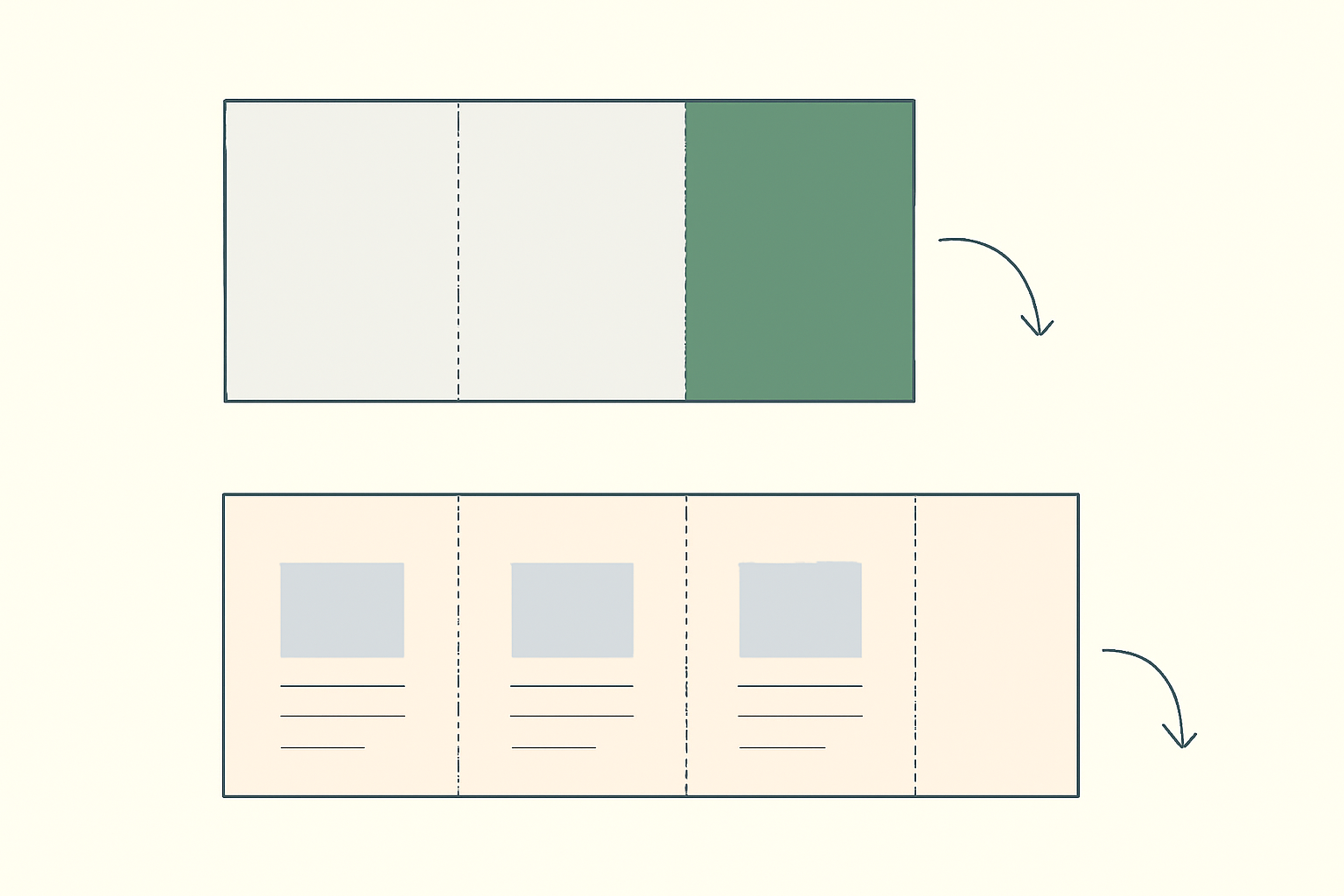
Take one sheet of paper in landscape orientation. Make two vertical folds so the sheet divides into three equal-ish columns. Fold one outer column inward, then fold the other outer column over the top of it. You now have something the width of a single panel, with printed content hiding inside.
A few things follow from that geometry:
- You get six panels, not three. Three on the front of the sheet, three on the back.
- Only one panel is seen first. Everything else is a reward for opening it.
- The panels are tall and narrow. A tri-fold panel is roughly a third as wide as it is tall, which is closer to a phone screen than to a page. Layouts that work on a flyer often do not survive being squeezed into that column.
- It has to close flat. That constraint is what creates the narrow-panel rule further down.
Tri-folds are the default for things that need to be picked up, carried and read in a couple of minutes: service menus, event programmes, museum guides, clinic information sheets, restaurant takeaway menus, real estate listings, conference handouts.
The panel map — the part that goes wrong #
Here is the thing that catches almost everyone. When you design the flat sheet, the leftmost panel on your screen is not the front cover, and the middle panel is not "page 2".
The most common tri-fold arrangement is a roll fold: the right-hand third tucks in first, then the left-hand third folds over the top of it. Under that arrangement, the panels map like this.
| Sheet side | Left panel | Middle panel | Right panel |
|---|---|---|---|
| Outside | Front cover | Back cover | Inside flap (tucks in) |
| Inside | Reverse of the flap — seen first when the cover opens | Main spread, left | Main spread, right |
Two things worth noticing:
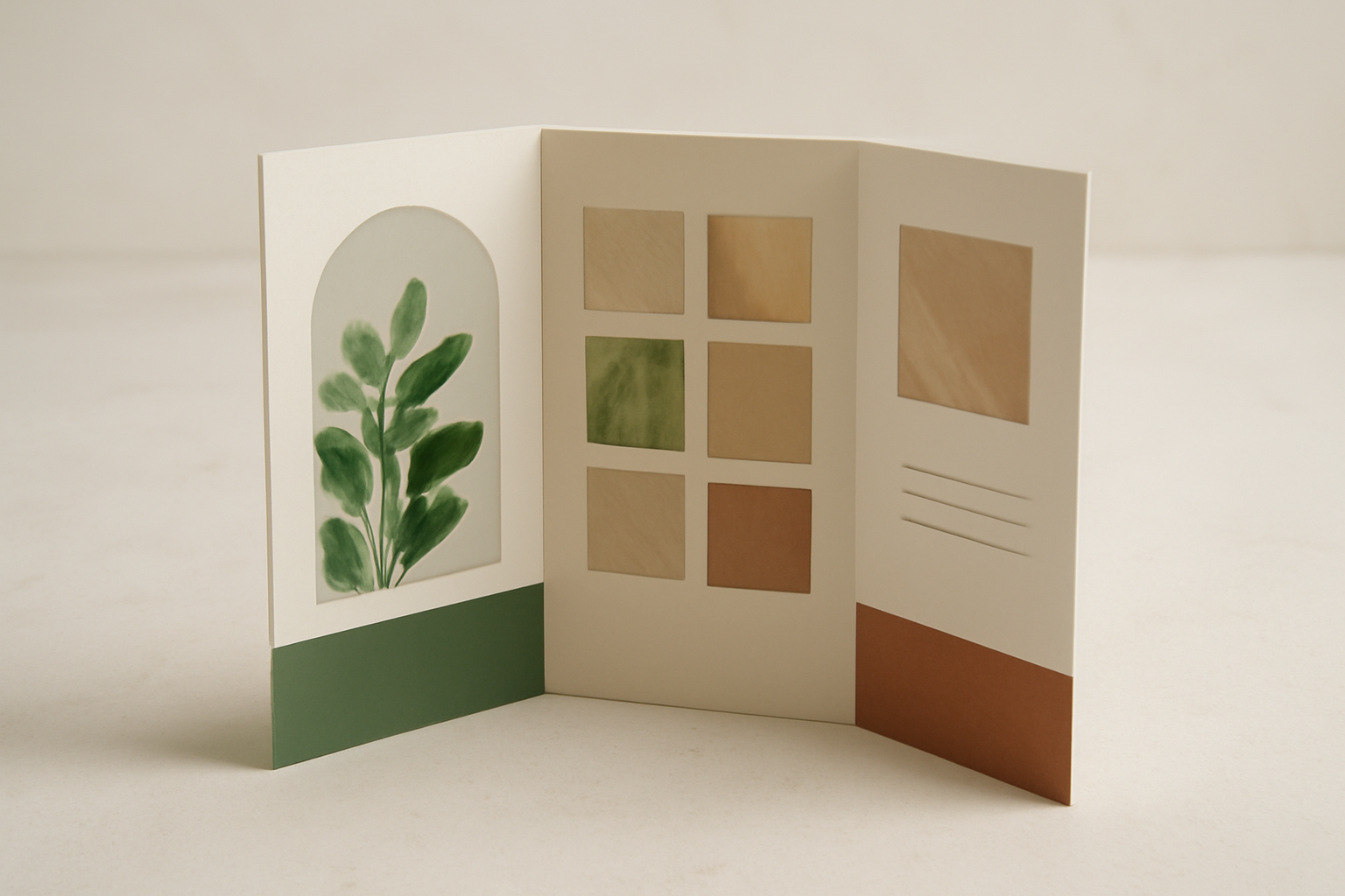
- The inside three panels read as one continuous spread. This is the best real estate in the whole piece. A photo or a colour band can run straight across all three panels, and it looks deliberate in a way that three separate boxes never will.
- The two sides are mirrored. Flip the sheet over and left becomes right. The panel sitting behind your front cover is on the opposite end of the inside sheet from where the cover is on the outside sheet.
Both conventions exist in the wild — some printers put the cover on the right of the outside sheet instead, because they fold the other outer panel in first. The deciding factor is which panel tucks inward, and that is a printing decision, not a design one. If your printer gives you a template, believe their template over any diagram, including this one.
The narrow panel rule #
If you divide the sheet into three mathematically equal thirds, the brochure will not close properly. The panel that folds inward has to travel around the thickness of the paper, so it needs to be slightly shorter than the panels wrapping it — usually by about 1.5 to 3 mm, or roughly a sixteenth of an inch.
On a US Letter tri-fold that typically means two panels at about 3.69 inches and the tucked panel at about 3.62 inches. On thin paper you can get away with equal thirds. On heavier card stock you absolutely cannot.
This is one of the few places where a print shop template genuinely saves you a reprint. Ask for one before you start.
Standard tri-fold sizes #
Set your page size before you design anything. Canva's Resize feature is a Pro feature, so changing your mind later either costs money or costs you an afternoon of rebuilding.
| Sheet (landscape) | Flat size | Panel size (approx) | Typical use |
|---|---|---|---|
| US Letter | 11 x 8.5 in | 3.67 x 8.5 in | The US default — menus, service sheets |
| A4 | 297 x 210 mm | 99 x 210 mm | The international default; folds to fit a DL envelope |
| US Legal | 14 x 8.5 in | 4.67 x 8.5 in | Wider panels when there is more to say |
| A3 | 420 x 297 mm | 140 x 297 mm | Large programmes, maps, exhibition guides |
| A5 | 210 x 148 mm | 70 x 148 mm | Pocket cards, small product inserts |
The A4 one is worth remembering: a folded A4 tri-fold is 99 x 210 mm, which is DL envelope size. If your brochure is going in the post, that is the format that does not need a custom envelope.
Tri-fold vs the other folds #
"Tri-fold" gets used loosely for anything folded more than once. These are the folds it actually gets confused with.
| Fold | What it does | Panels | Reads like |
|---|---|---|---|
| Bi-fold | One fold down the middle | 4 | A small booklet |
| Tri-fold (roll or letter fold) | Two folds, one panel tucks inside the other | 6 | Cover, then a continuous spread |
| Z-fold | Two folds in opposite directions, concertina style | 6 | Panel by panel, like turning pages |
| Gate fold | Two outer panels fold in to meet in the middle | 6 | Two doors opening onto a centre panel |
The practical difference between a tri-fold and a z-fold is the reveal. A tri-fold hides everything behind one cover and then opens onto a single wide spread — good when you have one big idea or one big image. A z-fold unfolds in stages, so it suits a sequence: step one, step two, step three. A gate fold is a theatrical choice and costs more to fold.
How to lay one out in Canva #
Before any apps, the honest version: Canva on its own can do all of this. There are thousands of free brochure templates, custom page dimensions are free, Frames and Grids are free, the bleed toggle is free, and the PDF Print export at 300 DPI is free. If your event is Friday, open a template and go — that is a completely reasonable answer.
If you are building from scratch, the sequence that avoids rework is:
- Set the page size first, in inches or millimetres, landscape, using the flat sheet size from the table above. Not the folded size.
- Make two pages, one for the outside and one for the inside. Not one page with six columns.
- Draw your fold guides. Add two thin vertical lines at your panel widths, lock them, and delete them before export. Canva's rulers and guides are under View.
- Turn bleed on under File, and push every background colour or photo past the trim edge. A brochure that is folded and trimmed is very unforgiving about this — if you are not sure what bleed means, we wrote a whole post on it.
- Keep text about 5 mm clear of every fold and every edge. A headline that runs across a crease gets creased.
- Export as PDF Print. PDF Standard is screen resolution and will look soft on paper.
The cover panel #
The cover is the only panel that has to do a job on its own, and a photo cut to a meaningful shape does more work there than a photo in a rectangle. That is what Image to Frame is for: it takes a PNG, SVG or JPG up to 5MB and turns it into a real Canva frame, so you can drop any photo or video inside it and reposition the image within the shape.
You can feed it a file from your computer, point it at an image already sitting on the page, or use Export design to flatten several elements into one shape. The rule that decides whether it works: the source needs a transparent background. Give it an image with a white background and you get a rectangle — technically a frame, just not an interesting one. Canva's own Background Remover handles this, though it is a Pro feature. Very intricate outlines can fail to convert, in which case the app points you at its Frame Store instead.
One thing that looks like a bug and is not: the border thickness and colour sliders only render after you hit Add frame to design, not in the preview. The app itself is a Pro app, with a free tier for students and teachers.
The inside spread #
The inside three panels are one canvas, which makes them a layout problem rather than a decoration problem. Frames Lab is the app for building a layout to a number rather than by eye. Its Create tab has five modes, and three of them matter for a brochure:
- Grid — set columns, rows and gap, then use Advanced for rounded corners, a straight border, or merging the whole thing into one block. A three-by-two tile grid across the centre panel is the classic tri-fold interior.
- Arc — a curved or arched panel, controlled by Pill degrees and a Start angle. A 270-degree arch at the top of a panel is the look that has quietly taken over event print.
- Diagonal — angled strips with adjustable spacing, gap and angle. Around 20 degrees reads as deliberate; much more and it reads as a mistake.
Two gotchas worth knowing before you start. Frames auto-scale to the design that is currently open, so set your brochure page size before you generate anything. And grids past roughly 30 cells get blocked — which is not a problem for a brochure, but is worth knowing if you try to fit a forty-photo spread into one panel. There is also an Explore tab of ready-made frames and a Style tab for adding blur, border or inner shadow to a frame you already used. The free tier limits how many frames you can add.
If you are still deciding between Canva's built-in Grids and a shaped frame, we compared them here.
The headline #
On a narrow panel, a headline filled with a photograph is one of the few effects that does not just eat space. Text to Frames turns each character into its own real Canva frame, so you can drop a different image into every letter and drag it around inside.
The honest limits: up to 200 characters before it tells you the text is too long, five free fonts (Roboto, Open Sans, Lato, Playfair Display and Pacifico) with 100-plus more on Pro, letter spacing from -100 to 100, and a Split into letters toggle for per-character images. The bold and italic buttons grey out when the font has no real bold or italic cut, which is deliberate rather than broken. The effects — Blur 0 to 20, Border 0 to 50, Inner shadow 0 to 40 — are Pro.
One rule decides whether this looks good: use a heavy font. A thin or script face leaves so little interior that the photo reads as texture, not as a picture. And if you see "Frames can't be added to this design type", your page is a design type Canva does not allow frames in — rebuild it as a custom size.
The edges and the colour #
Border Art Maker builds repeating borders from dots, built-in icons or an uploaded image, distributing them evenly and letting you adjust spacing and rotation. On a brochure it is what makes three panels read as one set. Go lighter than looks right on screen — a border that looks delicate on a monitor prints heavier than you expect. And it decorates an edge; it does not cut one.
Color Harmony generates palettes from one base colour or HEX value using complementary, analogous, triadic, tetradic, split-complementary and monochromatic relationships, saves them as a brand set, and works with Canva's Apply colors to page. On a piece this small, monochromatic or analogous almost always beats a full triadic scheme. Pick the palette before you print, not after the second version comes back in a slightly different blue.
Before you send it #
- Print one at actual size and fold it by hand. Ten minutes with a sheet of paper and a bone folder will catch more problems than any amount of on-screen checking.
- Check at 100% zoom, not the 30% you designed at.
- Look at every fold line for text or faces sitting on the crease.
- Confirm the paper. Matte or glossy changes how the whole thing reads, and matte absorbs more ink so push your contrast slightly.
- Vector logos, not screenshots. SVG and PNG behave differently at print size.
- If there is a QR code on it, test the printed one with a real phone before the full run. Canva's QR generator changed in 2026 and not every code type survived.
So what is a tri-fold, in one line #
One sheet, two folds, six panels, and a cover that has to earn the open. Get the panel map and the narrow-panel measurement right and the rest is just design — the same design you would do on a poster or a flyer, only in a column.
Frequently asked questions
In the US, a tri-fold is usually a landscape US Letter sheet, 11 x 8.5 inches, folded into three panels of roughly 3.67 x 8.5 inches each. Internationally it is a landscape A4 sheet, 297 x 210 mm, folded into three panels of about 99 x 210 mm — which is why a folded A4 tri-fold slips neatly into a DL envelope. Legal size (14 x 8.5 in) gives you wider panels if you have more to say.
On a tri-fold, one panel folds inward and the other folds over the top of it. If all three panels are exactly the same width, the tucked-in panel has nowhere to go and the brochure buckles or will not close flat. Printers usually make the tucked panel about 1.5 to 3 mm (roughly 1/16 inch) narrower. If your printer supplies a template, use their measurements rather than dividing the sheet into equal thirds yourself.
Yes. Canva has free brochure templates, free custom page dimensions, free Frames and Grids, a free bleed toggle and a free PDF Print export — which covers everything a tri-fold technically needs. The paid parts are optional: Resize (so pick your page size before you start designing), Background Remover, and most of the Qrdy apps beyond their free tiers.
Related products


More from QRdy Blog
10 Thanksgiving Design Ideas You Can Make in Canva (Printable Decor, Menus & More)
Ten Thanksgiving projects you can actually design and print at home this year — turkey-shaped photo frames, a "GRATEFUL" photo banner, menu cards, a Friendsgiving invite, a November countdown and more. Each one names the Canva app that does the hard part.
CMYK vs RGB: Which Color Mode Should You Use (and What Canva Actually Does)
RGB is light, CMYK is ink — and that one difference is why your print came back duller than the screen. Here's the plain-English comparison, plus exactly what to do about it inside Canva.
The Best Canva Apps for Photo Books & Photo Albums (2026)
A photo book is 40 pages of the same three layouts unless you give yourself better tools. These are the Canva apps that actually speed up building a photo book or album — grid spreads, custom-shape pages, a photo-filled cover — plus what Canva already does well on its own.