
10 Baby Milestone Photo Ideas You Can Make in Canva (Cards, Grids and Announcements)
Twelve monthly photos, one birth announcement, and a nursery wall that has to survive the next ten years. Here are 10 baby keepsake ideas you can build in Canva — with the exact frame settings, print sizes and honest limits for each one.
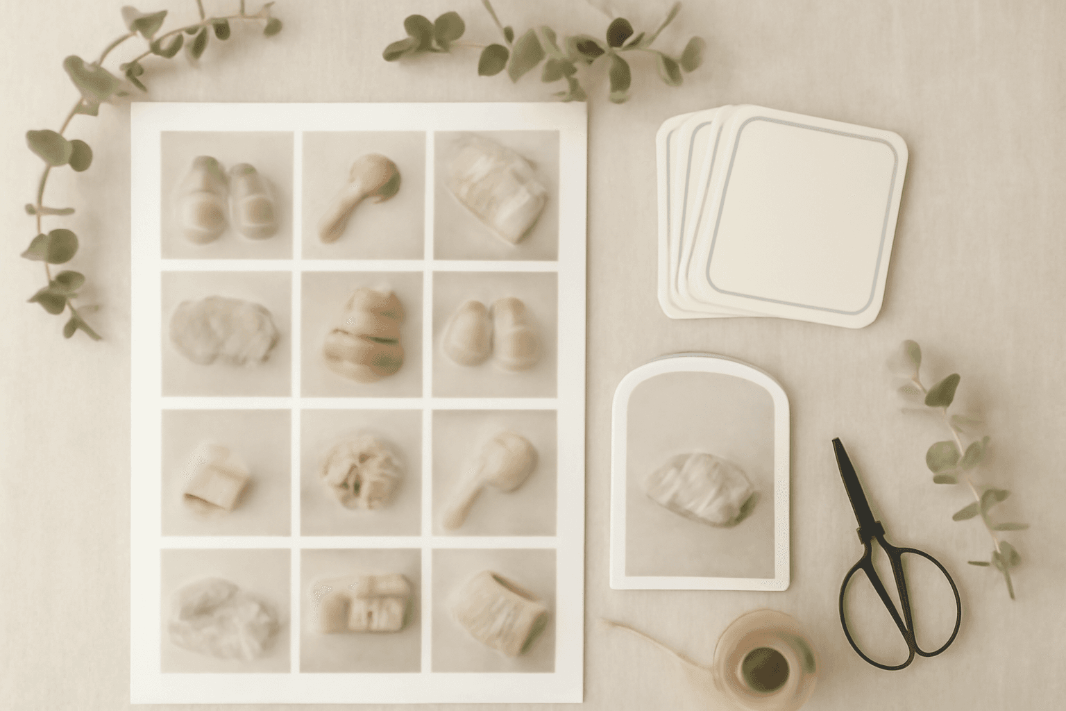
The first year produces an absurd number of photos and almost no finished objects. Everyone means to make the monthly cards. Most people get to month three, the template stops matching, and the rest lives in a camera roll.
The fix is not more creativity — it is picking a format once and reusing it twelve times. Below are ten baby keepsake ideas that each have a repeatable structure, plus the specific settings that make them work in Canva.
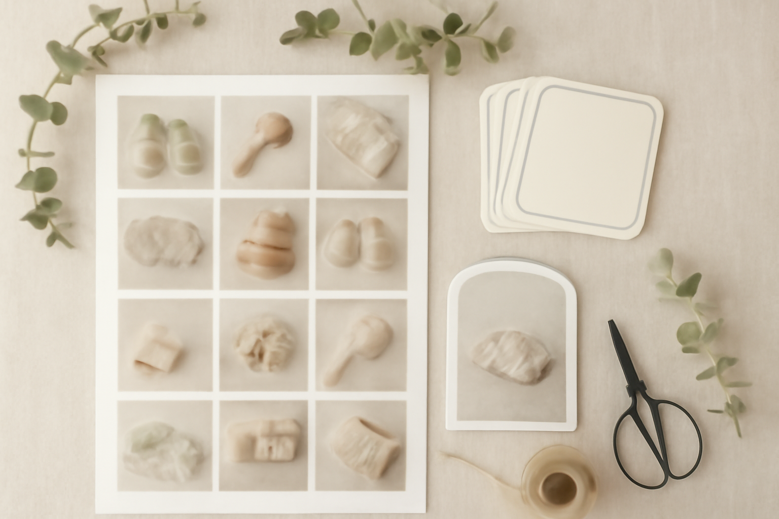
First, the honest part: Canva already does most of this #
Before any app: Canva gives you thousands of free baby announcement and milestone templates, free Grids, free Frames, custom page sizes, a bleed toggle and PDF Print export. If the shower is Saturday, open a template and go. Nobody will know.
Apps become worth it when you want something built to a number rather than picked off a shelf — a grid with an exact gap so all twelve months line up, an arch at a specific angle, a name where each letter holds a different photo, or a frame shaped like a onesie you uploaded yourself. That is the line I have used throughout.
Idea 1 — The twelve-month grid poster #
The one keepsake that justifies the whole year. Twelve squares, one per month, printed as a single poster.
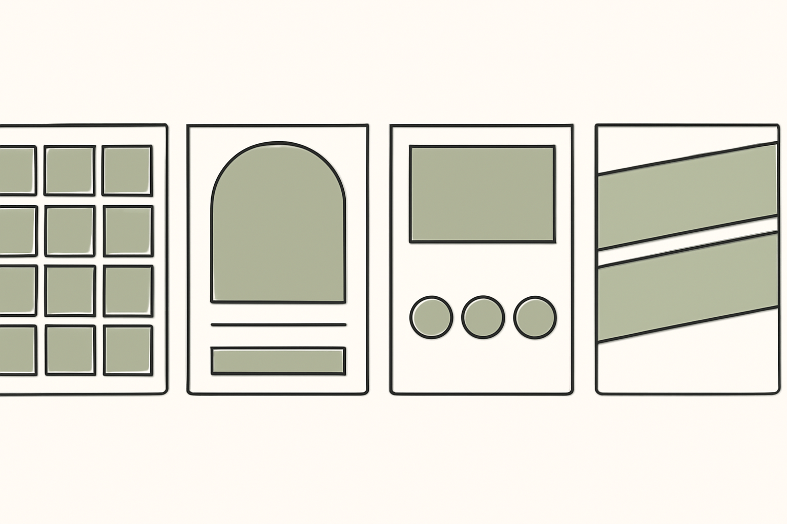
Build it with a grid frame rather than by placing twelve images by hand, because hand-placed photos never align and you will notice forever.
- Open Frames Lab, go to the Create tab and pick the Grid mode
- Set Layout to 3 columns by 4 rows, and give it a gap — 8 to 16 px reads as deliberate
- Under Advanced, turn on rounded corners for a softer look, or leave them square for a more editorial one
- Press Add to design, then drag one photo into each cell
Two things to know. The frame auto-scales to whatever page is currently open, so set your poster size first. And Frames Lab blocks layouts above roughly 30 cells — twelve is nowhere near it, so you have headroom if you want to add a border row of captions later.
Idea 2 — Monthly milestone cards, designed once #
The cards you hold next to the baby in the photo. The mistake is designing twelve cards; the move is designing one card and duplicating it.
Make a single square page at 5x5 in, put your frame and a caption bar on it, then duplicate the page eleven times and change only the number. When it comes time to print, copy all twelve onto a Letter or A4 sheet — four fit per sheet at 5x5 in, six at 4x4 in.
Print them all at the start of the year. A card you have to design in month seven is a card that does not get made.
Idea 3 — The arch-top announcement #
The arch has quietly taken over birth announcements, and it is the one shape Canva does not hand you as a frame.
In Frames Lab, choose the Arc mode. Two controls do the work: Pill sets how much of a circle the arch covers, measured in degrees, and Start sets where the curve begins. A 270-degree arc with the flat edge at the bottom is the classic announcement shape. Add a Border in a soft neutral if the photo runs light at the edges, then Add to design and drop your photo in.
Leave the lower third empty for name, date, weight and length. The photo does not need to fill the card.
Idea 4 — Number-of-the-month medallions #
A small circle holding the month number, sitting over the corner of the photo. Cheap to make, and it turns a random snapshot into part of a series.
Circles are one of the few shapes Canva does give you free — our guide on how to crop a picture into a circle in Canva covers the native route in full. Use Frames Lab only if you want a ring of circles generated at even spacing rather than one at a time.
Keep the medallion in the same corner on all twelve. Consistency is what makes a set look intentional.
Idea 5 — The name, spelled in photos #
For the nursery wall: the baby's name where every letter is filled with a different photo.
Text to Frames turns each character into a real Canva frame, so after you place it you can drag and zoom the photo inside a letter exactly like any other frame. Type the name, pick a font, turn on Split into letters, then Add to design and fill each one.
Practical notes from using it:
- Pick a heavy font. In a thin letter you see texture, not a picture — this is the single decision that makes or breaks the result
- The free tier includes five fonts (Roboto, Open Sans, Lato, Playfair Display and Pacifico); the 100-plus font library and the Blur, Border and Inner shadow effects are Pro
- The text field caps at 200 characters, which no name will trouble
- If bold or italic is greyed out, the font simply has no real cut for it — the app locks it rather than faking one
- Some Canva design types refuse frames entirely and you will see "Frames can't be added to this design type"; open a Poster or Instagram Post instead
If the idea is new to you, what are photo letters explains how it differs from putting one image across a whole word.
Idea 6 — A frame shaped like a onesie, a bear or a footprint #
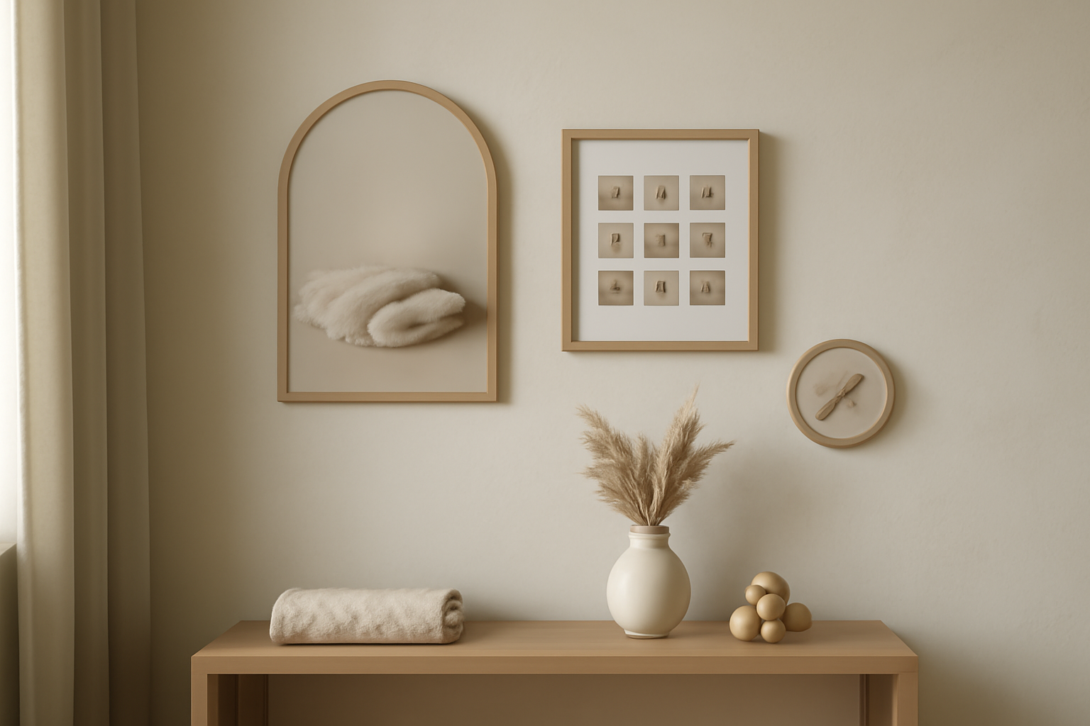
Any shape can become a photo frame if you have it as a transparent image. Upload a onesie silhouette, a teddy outline, a footprint, a star — Image to Frame converts PNG, SVG or JPG up to 5 MB into a real Canva frame.
The rule that decides whether it works: the source must have a transparent background. Feed it a PNG with a white background and you get a rectangle, because a rectangle is genuinely what the outline is. Remove the background first (Canva's own Background Remover is a Pro feature) and the frame hugs the real shape.
Two more honest limits. Very intricate outlines — lace, fine script, dense linework — sometimes fail to convert, and the app suggests a different file or a ready-made shape from its Frame Store. And the border thickness you set only renders after you press Add frame to design, not in the preview. That is expected behaviour, not a bug.
The app itself is Pro, with a free tier for students and teachers.
Idea 7 — A first-year calendar #
Twelve photos, twelve months, one wall calendar that doubles as the keepsake. This is the version relatives actually ask for.
Calendar Maker builds the date grids so you are not typing cells. Open the Month tab, turn on Add all months to generate all twelve at once, and turn on Each month on its own page so you get a proper twelve-page document. There are around fourteen decorative page templates and more than thirty preset colour sets if you would rather not style the header and number rows by hand.
Then place a photo frame above each month's grid and fill it. If you want the wider context first, what is a photo calendar covers formats and sizes.
Idea 8 — The growth strip #
One narrow vertical strip down the side of a page, holding four to six photos in order. It reads as a timeline without needing any labels.
Use the Grid mode again, but set it to 1 column by 6 rows with a small gap, and use the Merge into one block option under Advanced if you want the strip to behave as a single element when you move it. It is the same instinct behind a photo booth layout — how to make a photo strip in Canva has that version.
Idea 9 — The then-and-now split #
Two photos, one diagonal seam: newborn on one side, first birthday on the other. It works because the eye reads a diagonal as a passage of time in a way it does not read a straight vertical line.
The Diagonal mode in Frames Lab gives you spacing, gap and an angle control. Around 20 degrees looks deliberate; much more than that looks like a mistake. Two cells is all you need.
Same trick works for siblings at the same age, which is the version that makes grandparents cry.
Idea 10 — One border that ties the whole set together #
The last five percent. Twelve cards with the same dotted edge stop looking like twelve cards and start looking like a set.
Border Art Maker builds repeating borders out of dots, built-in icons or your own uploaded image, distributes them evenly and lets you adjust spacing and rotation. Copy the finished border onto every card.
One print caveat worth repeating: go lighter than looks right on screen. Screens are backlit and paper is not, and a border that reads as delicate on a monitor often prints heavy.
Sizes worth knowing before you design #
| Keepsake | Common size | Notes |
|---|---|---|
| Milestone card | 5x5 in (127 mm) | Four per Letter or A4 sheet |
| Milestone card, small | 4x4 in (102 mm) | Six per sheet, easier to hold in frame |
| Birth announcement | 5x7 in (127x178 mm) | Fits a standard A7 envelope |
| First-year grid poster | A3, 297x420 mm | Or 11x17 in tabloid |
| Nursery print | A4 or 8x10 in | 8x10 in matches off-the-shelf frames |
| Wall calendar page | A4 or Letter | Portrait, grid in the lower half |
Set the size first. Canva's Resize feature is Pro, and enlarging a finished design is how sharp artwork becomes soft artwork.
Before you print #
- Export as PDF Print, not PDF Standard — the second one is screen resolution
- Turn on the bleed toggle under File if anything runs to the edge, or you risk a white sliver down one side after trimming
- Keep names and dates at least 5 mm inside the trim line
- Check the preview at 100 percent zoom, not the 25 percent you designed at — see what is DPI if a photo looks soft and you are not sure why
- Print one card at actual size before you print twelve
More on the trim-and-bleed side in what is bleed in printing.
Start with the grid #
If you only make one thing from this list, make the twelve-month grid. It is the only format here that gets better the longer you keep going, and it forgives every month where the photo was taken badly, in bad light, at 6am.
You can build it entirely free with Canva Grids. Frames Lab just gets the gaps right on the first try.
Ready to try it: Frames Lab in Canva for the grids and arches, Image to Frame for shaped frames, Text to Frames for photo-filled names, and Calendar Maker for the first-year calendar.
Frequently asked questions
Most printed milestone cards are square, between 4x4 in and 5x5 in (roughly 100-125 mm). At 5x5 in you fit four per Letter or A4 sheet with room to trim; at 4x4 in you fit six. Set the card size in Canva before you design, because resizing a finished design needs Canva Pro, and scaling artwork up after the fact is what makes printed cards look soft.
Canva alone covers a lot of it. Grids, Frames, custom page sizes, the bleed toggle and PDF Print export are all free, and there are thousands of free baby templates. Apps earn their place when you want something built to a number rather than picked from a shelf: a 3x4 grid with an exact gap, a 270-degree arch, a name where every letter holds a different photo, or a frame shaped like a onesie you uploaded.
Almost always resolution. A phone photo cropped hard into a small square can drop below 300 DPI at print size, and Canva will not warn you. Check the download preview at 100 percent zoom rather than the 25 percent you designed at, export as PDF Print rather than PDF Standard, and if a crop looks soft, go back to the original file instead of the version already compressed by a messaging app.
Related products


More from QRdy Blog
How to Make a Hat Mockup From a Photo (So the Design Curves With the Cap)
Turn one photo of a blank cap into realistic hat mockups: drag a box around the front panel, let the design wrap the curve with the photo's real shading, then render all your designs at once in your browser.
The Best Canva Apps for Family Reunions (2026): Invites, Banners, Photo Walls and Calendars
Planning a family reunion in Canva? Here are the five Qrdy apps that actually help: shaped photo invitations, photo-letter banners, photo-wall grids, a countdown calendar and a QR link that can change after printing.
How to Make a Birthday Calendar in Canva (Family Birthday Tracker, Step by Step)
Build a printable family birthday calendar in Canva: 12 months, one page each, with names added in minutes. A step-by-step tutorial using Calendar Maker, plus honest notes on what Canva does on its own.