
Serif vs Sans Serif: What's the Difference, and Which Font Should You Use?
Serif fonts have small strokes at the ends of their letters; sans serif fonts don't. Here's what that changes for readability, print, screens and pairing — and why heavy sans serifs win when you put photos inside letters.
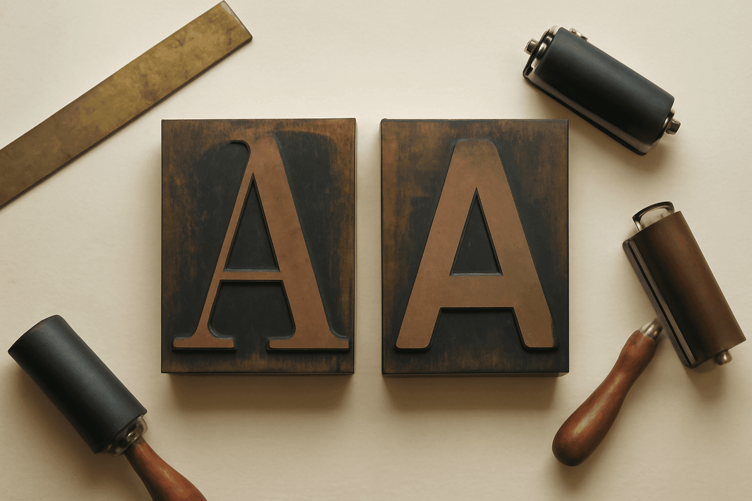
A serif font has small strokes, called serifs, at the ends of its letters, while a sans serif font ("sans" is French for "without") does not. That is the whole technical difference. The practical difference is bigger: it changes how a design reads at a distance, on a small screen, and — if you put photos inside your letters — whether the photo shows up at all.
This guide compares the two side by side, gives you a quick rule for picking one, and covers the one situation most font guides skip: photo-filled lettering, where the choice matters more than usual.
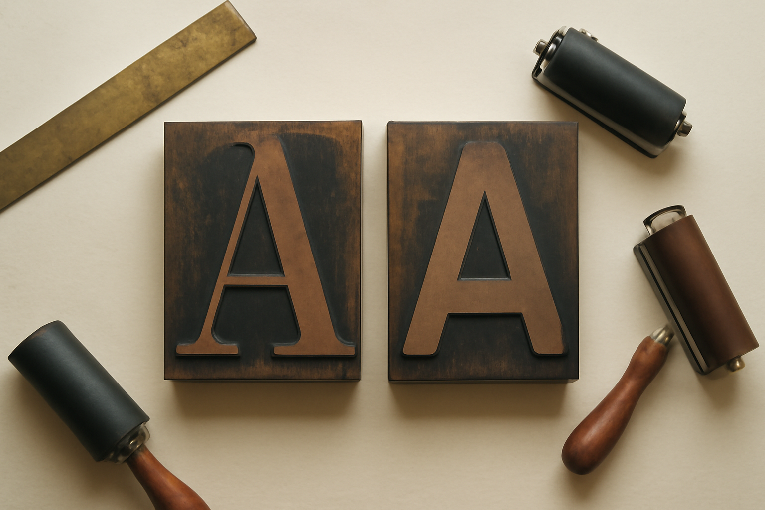
Serif vs sans serif at a glance #
| Serif | Sans serif | |
|---|---|---|
| What defines it | Small strokes (serifs) at the stroke ends | Plain, flat stroke ends |
| Stroke weight | Usually thick-and-thin contrast | Usually even, or close to it |
| Feels | Traditional, editorial, formal, "established" | Modern, clean, neutral, friendly |
| Common examples | Times New Roman, Georgia, Garamond, Playfair Display | Helvetica, Arial, Calibri, Roboto, Open Sans, Lato |
| Strongest at | Long printed text, titles that need elegance | Screens, small sizes, signage, UI, bold headlines |
| Weakest at | Tiny sizes on low-resolution screens; very thin weights at a distance | Long formal documents where it can feel flat |
| Inside a photo frame | Thin strokes hide the photo | Heavy weights show the photo clearly |
Two quick answers to questions people search constantly: Times New Roman is a serif font, and Calibri is a sans serif.
What a serif actually is #
Look at the bottom of a capital "T" in Times New Roman and you will see a short horizontal foot. That foot is a serif. Serifs trace back to carved and brush-written Roman capitals, and they stayed through centuries of printing because they give each letter a distinct end-point and help the eye track along a line of small printed text.
Most serif fonts also have stroke contrast: the vertical strokes are thick and the horizontal strokes (and the serifs themselves) are thin. That contrast is what makes a serif look elegant — and, as you will see below, what makes it tricky at small sizes or inside a frame.
Serif fonts come in a few families worth knowing by name:
- Old-style (Garamond) — soft, warm, low contrast; bookish.
- Transitional (Times New Roman, Georgia) — sharper, more upright; the newspaper and essay look.
- Didone / high-contrast (Playfair Display, Bodoni) — very thin hairlines against very thick stems; the fashion-magazine look.
- Slab serif (Rockwell, Roboto Slab) — thick, block-like serifs with little contrast; sturdy, poster-friendly, and the serif that behaves most like a sans.
What a sans serif actually is #
A sans serif drops the feet. The strokes end flat, and the weight is usually even from stroke to stroke. The style became common in 20th-century signage, posters and, later, screen interfaces, because clean shapes stay recognisable at low resolution and from far away.
Sans serifs also split into recognisable groups:
- Grotesque / neo-grotesque (Helvetica, Arial) — neutral, the default "no-style" style.
- Humanist (Calibri, Open Sans, Lato) — based on handwritten proportions, a little warmer and very readable in body text.
- Geometric (Futura, Montserrat, Poppins) — built from circles and straight lines; crisp and modern.
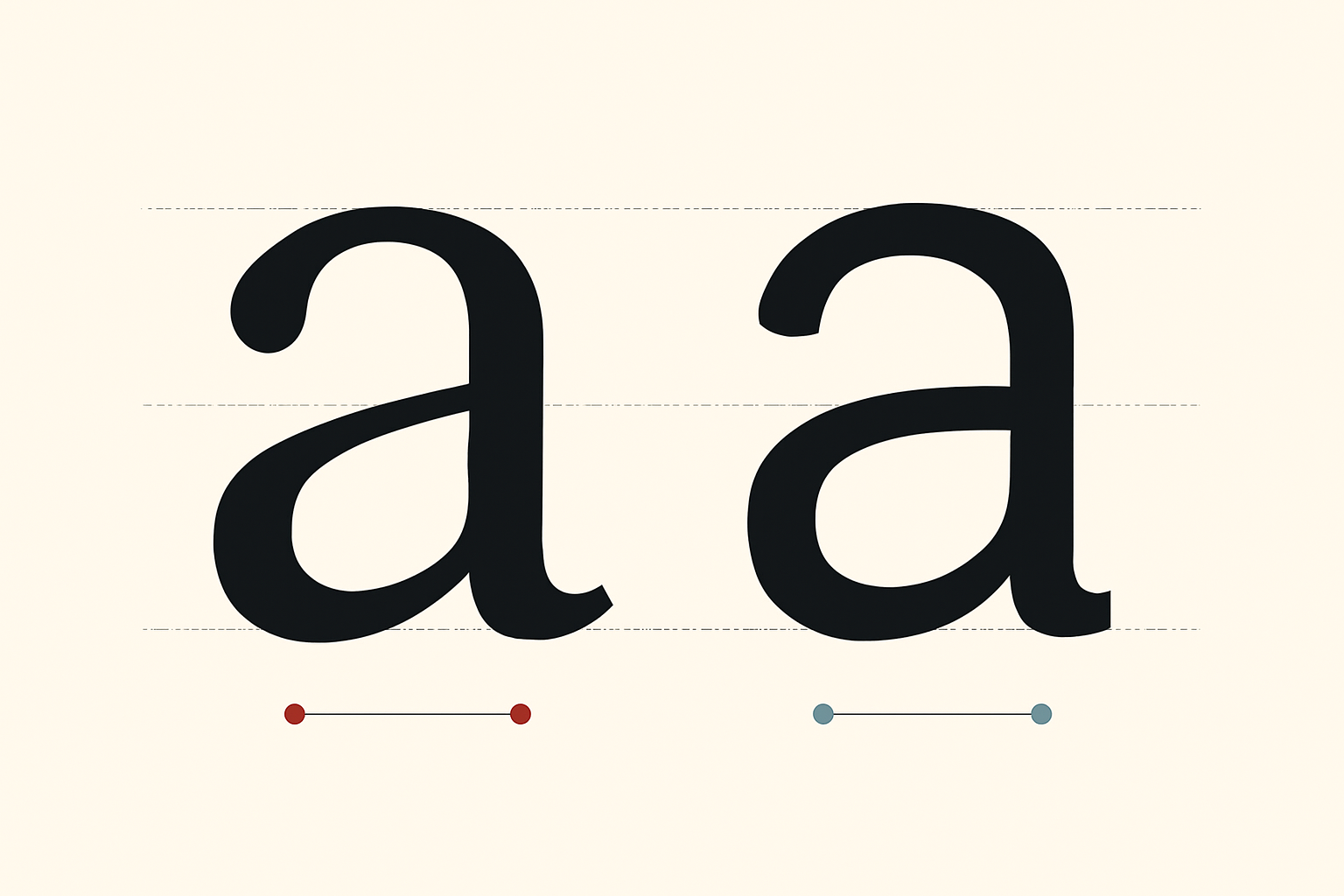
Which is easier to read? #
The honest answer: at normal sizes, with a well-made font, both are perfectly readable, and the research on "serif is better for print, sans is better for screens" is far less decisive than the rule of thumb suggests. What actually decides readability is:
- Size — below roughly 10–12 px on screen, the thin hairlines of a high-contrast serif can break up. A sturdy sans or a slab serif holds together better.
- Weight — thin weights of either style fade at a distance or on a busy background. Regular or medium is the safe default for body text.
- Spacing — tight letter spacing hurts both styles more than the serif choice does.
- Familiarity — people read fastest in what they are used to reading, which is why books still lean serif and apps lean sans.
For accessibility, the common advice is a plain, well-spaced sans serif with clearly different shapes for similar characters (capital I, lowercase l and the number 1). That is sensible guidance, but a sturdy, open serif like Georgia is also a perfectly accessible choice for body text.
When to use serif vs sans serif #
- Printed long-form text (booklets, menus with descriptions, newsletters) — serif is the traditional choice and still works beautifully.
- Anything read on a phone — sans serif is the safer default, especially for small text.
- Headlines on posters, banners and thumbnails — a bold sans is the workhorse. A high-contrast serif works too if it is set large.
- Formal or heritage feel (wedding suites, certificates, restaurant branding) — serif carries the tone.
- Modern, friendly or tech feel — sans serif.
- Business cards and small print — a sans or a slab at 8pt and up; avoid hairline serifs that can disappear in print.
The pairing rule that works almost every time #
You rarely have to pick one for the whole design. The most dependable pairing is one serif and one sans: a serif headline over sans body text (classic, editorial), or a bold sans headline over serif body text (modern but warm). Keep it to two families, and give them clearly different jobs so they do not look like a mistake.
The case most guides skip: photos inside letters #
If you are filling letters with photos — a name where every letter shows a different memory, an event title, a big word on a poster — the serif-vs-sans choice stops being about style. It becomes about how much photo is visible.
A photo can only show through the area inside the letter's strokes. A thin, high-contrast serif gives the photo a hairline to live in; you see a sliver of colour and lose the picture. A heavy sans serif gives it a wide, even channel, so the ocean or the face or the sunflower actually reads.
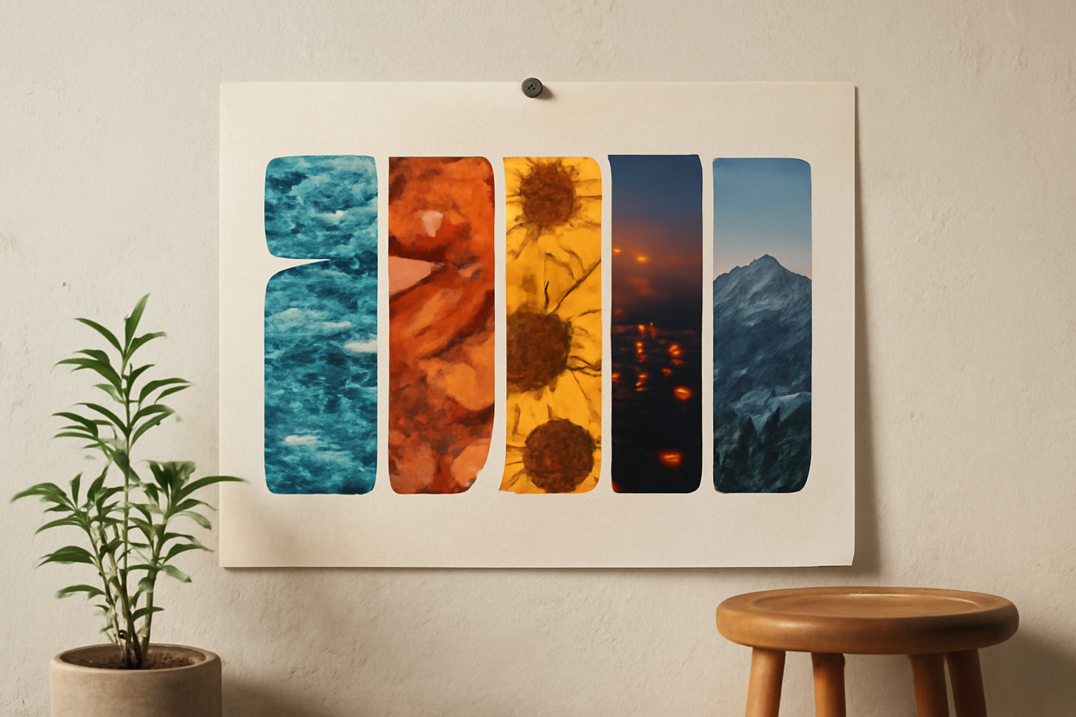
The rule we use: for photo-filled lettering, pick the heaviest weight of a wide sans serif, or a slab serif. If you love a serif look, choose one with chunky strokes rather than a fashion-style hairline serif, and set it large.
How to test it in Canva #
Canva's own route is to put a photo behind or inside text with its built-in tools; we compared that approach in putting a photo inside text in Canva. It is free and fine for a single image across a word.
When you want each letter to be its own frame, we built Text to Frames for that job. You type up to 200 characters, choose a font, and it turns the text into real Canva frames you can drop photos (or videos) into. Turn on Split into letters and every letter becomes its own frame, so each one can hold a different photo. The preview shows exactly what will be added.
The free plan includes five fonts, and they happen to cover both sides of this comparison:
- Roboto — modern sans
- Open Sans — friendly, readable sans
- Lato — softly rounded sans
- Playfair Display — high-contrast serif
- Pacifico — script
Try the same word in Roboto and Playfair Display and look at the preview: the difference in how much photo shows through is obvious immediately. Pro unlocks the full library of 100+ fonts, including heavier display faces that are ideal for photo lettering, plus Border (0–50), Blur (0–20) and Inner shadow (0–40) effects. A border is the fix when a busy photo makes a letter sink into the background. The B and I buttons grey out when a font has no real bold or italic — that is deliberate, so you never get a faked, smeared bold.
A couple of practical notes: some Canva design types do not accept frames and the app will say "Frames can't be added to this design type" — create a Poster, Presentation or custom-size design instead. And if you want the full walkthrough, see how to fill each letter with a different photo in Canva.
Common mistakes #
- Thin serif at small size in print — hairlines can drop out. Go heavier or switch to a slab.
- Two similar sans serifs together — Arial and Helvetica side by side just looks like an error. Contrast the pair.
- Three or more families — the design starts to look like a ransom note. Two is plenty.
- Script or hairline serif inside a photo frame — the photo disappears. Use a heavy sans.
- Judging at 30% zoom — check text at 100% (and print one copy) before you send anything to the printer. Our guide to what DPI means covers the print side.
The verdict #
Neither style is "better". Serif fonts bring tradition, elegance and a comfortable rhythm for long printed text. Sans serif fonts bring clarity, neutrality and toughness at small sizes, on screens and from across a room. Pair one of each and give them different jobs, and you will rarely go wrong.
The one place the choice is not a matter of taste is photo-filled lettering: there, heavier and wider wins every time. For more ways to style type, see our roundup of the best Canva apps for text effects and our explainer on what photo letters are.
Frequently asked questions
Times New Roman is a serif font — look at the small horizontal feet at the ends of its strokes. Arial, Helvetica and Calibri are common sans serif fonts.
At normal sizes both are readable. Sans serif is the safer default for small text on screens and signage; serif remains a comfortable choice for long printed text. Size, weight and spacing matter more than the serif itself.
A heavy, wide sans serif or a slab serif. The photo only shows inside the letter strokes, so thin or high-contrast serifs leave almost no room for the image. In Text to Frames, compare Roboto and Playfair Display in the preview to see the difference.
Related products


More from QRdy Blog
The Best Canva Apps for Gift Tags (2026)
Gift tag season starts earlier than you think. Here are five Canva apps that make custom photo tags, decorative borders, name tags and QR tags faster than building each one by hand — plus what Canva already does well on its own.
How to Make Recipe Cards in Canva (Printable 4×6, with Photos)
A step-by-step guide to designing printable recipe cards in Canva: the right card size, a layout that still reads in a messy kitchen, a photo frame that isn't a plain rectangle, and how to print and cut a whole set at home.

What Is a Wall Calendar? Formats, Sizes, and How to Make Your Own
A wall calendar is defined by reading distance, not decoration — it has to be legible from across the room. Here are the five formats, the sizes that actually get printed, how it differs from a desk calendar, and how to design your own in Canva.