
How to Make a YouTube Thumbnail in Canva (That Still Reads at Phone Size)
A step-by-step Canva workflow for YouTube thumbnails: the right canvas size, a headline with the video's own footage inside the letters, a cut-out subject, and the phone-size test almost nobody runs before uploading.

Most thumbnails are designed at full size on a laptop and then seen at about 168 pixels wide on a phone. That gap is where good ideas die: the four-word headline turns into a grey smudge, the wide shot becomes an unreadable postage stamp, and the video loses the click before anyone reads the title.
This is the build order that survives the shrink — the right canvas, one cut-out subject, a headline big enough to read at a glance, and a final check at the size people actually see. Canva does most of it, and a couple of QRdy apps handle the parts Canva has no button for.
The specs, once #
| Thing | What YouTube wants |
|---|---|
| Dimensions | 1280 x 720 px (16:9) |
| Minimum width | 640 px |
| File type | JPG, PNG or GIF |
| File size | Under 2 MB |
| Shorts | Vertical 9:16 — 1080 x 1920 px |
Everything below assumes a 1280 x 720 page.
Step 1 — Start at the correct size, before anything else #
In Canva, either pick the YouTube Thumbnail preset or choose Custom size and type 1280 x 720 px.
Do this first, not last. Frames created by Canva apps scale themselves to fit the page that is open, and they only ever scale down, never up. Build a headline on a square Instagram page and then resize to 16:9 and you will be stretching artwork that was never meant to be that wide.
Step 2 — Decide the one thing the thumbnail says #
A thumbnail is not a summary. It carries one idea, and the title text underneath carries the rest.
Practically that means three to five words maximum, and words that are not already in the title — if the title says "I built a shed in a weekend", the thumbnail should not also say that. It should say "48 HOURS".
Write the words down before you open a template. It is much harder to cut a headline in half once it is already sitting there looking finished.
Step 3 — Cut out your subject #
The single biggest readability win is a person or object with a hard edge sitting on a plain background, rather than a full-frame photo with text floating on top.
- Canva Background Remover (Pro) is the fastest route — select the photo, Edit photo, Background Remover.
- If you already have a cut-out, keep it as PNG or SVG. A JPG can never hold transparency, so a "cut-out" saved as JPG arrives with a white box around it. That one fact explains most rectangular-frame complaints — there is a longer explanation in PNG vs SVG vs JPG in Canva.
- Push the subject to one third of the frame and leave the opposite third for the headline. Avoid the bottom-right corner entirely: that is where the duration stamp sits.
Step 4 — Build the headline #
Two honest options here, and the cheap one is often correct.
Option A — Canva's own text tools (free). Add a text box, pick a heavy sans or a chunky display face, and use Effects — Shadow, Lift, Splice, Hollow, Neon. For a solid-colour headline on a clean background, this is genuinely all you need. Skip the rest of this step.
Option B — the video's own footage inside the letters. This is the look that reads as "this is that video" rather than "this is a graphic about that video", and Canva has no native button for it. Text to Frames turns each character into a real Canva frame you can drop a still into.
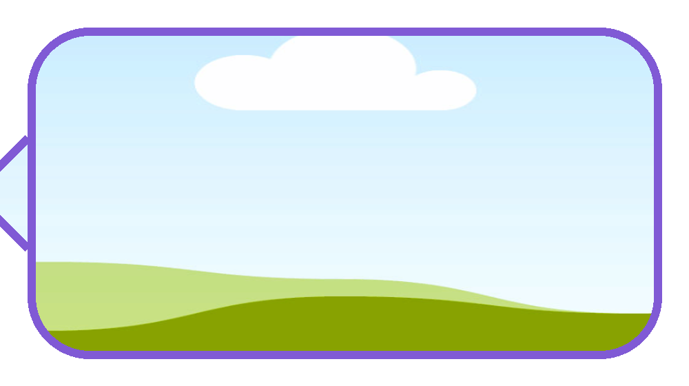
Inside the app:
- Type into the Text field. There is a 200-character cap; go over it and the preview says "Text is too long". A thumbnail headline is nowhere near that, so this only bites if you paste a title in by accident.
- Choose a Font. The free tier opens five — Roboto, Open Sans, Lato, Playfair Display and Pacifico — and Pro unlocks 100+, including the heavy display and pixel faces that suit thumbnails. If the B and I buttons are greyed out, that font simply has no real bold or italic cut, and the app refuses to fake one.
- Letter spacing runs from −100 to 100. For a thumbnail, tighten slightly: closer letters make a bigger, denser block of text at small sizes.
- Turn on Split into letters if you want a different frame — and therefore a different still — in each character. For a two-word headline, one image across the whole word usually reads better; save the per-letter treatment for names.
- The Border effect is the one that matters here. Photo-filled letters sink into a busy background; a border traced around each stroke lifts them straight back out. The slider runs 0–50 with a colour picker, and it is a Pro feature, as are Blur (0–20) and Inner shadow (0–40).
- Watch the Preview. It refreshes about half a second after each change and is generated exactly the same way as the final output, so what you see is what lands on the page.
- Hit Add to design. If you get "Frames can't be added to this design type", that is a Canva restriction on certain design types, not an app failure — a Custom-size or Presentation document accepts frames.
- Drag your still onto a letter and release while the letter is highlighted. Then double-click to reposition the image inside the letter. Dragging the edges resizes the frame instead, which is the mistake everyone makes once.
Step 5 — Put your face or logo inside a shape #
Two thumbnails in a row with the same channel mark start doing the work of a brand. Image to Frame converts a shape you already own — a logo, an icon, a hand-drawn scribble you scanned — into a Canva frame you can drop a face into.
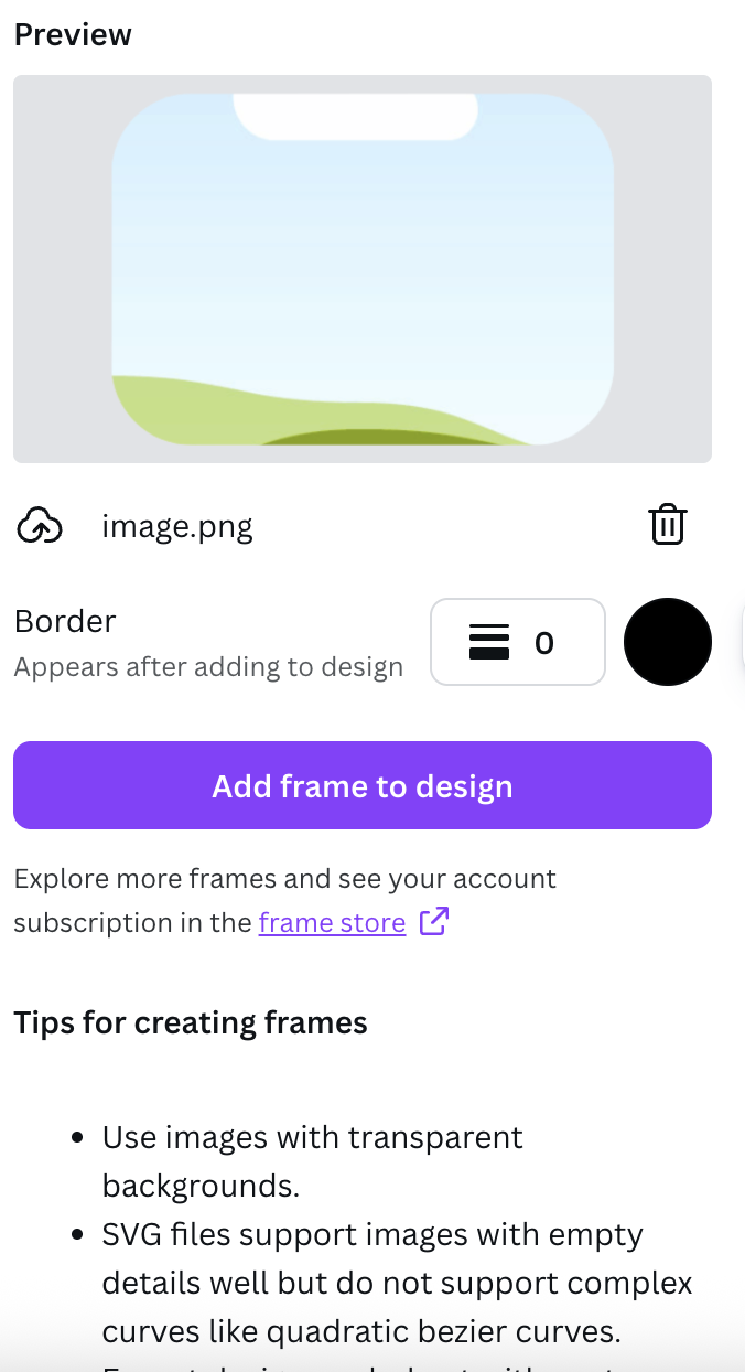
Worth knowing before you upload:
- Accepts PNG, SVG or JPG up to 5 MB, from three places: a file upload, an image already sitting on the page, or Export design, which flattens the whole page into one transparent PNG. That last one is the right path when your mark is several separate elements rather than a single file.
- Remove the background first. The app traces the outline it is given, so a logo on a white square becomes a rectangle.
- The border slider (0–50, with a colour) only renders after you add the frame to the design. It not appearing in the preview is expected, not a bug.
- Very tangled curves sometimes fail to convert. A simplified SVG usually goes through, or grab something from the Frame Store.
Step 6 — Split the frame if the video is a comparison #
Before-and-after, versus, top-three — these want two or three panels, not one photo. Frames Lab builds the panel layout for you instead of you nudging rectangles.
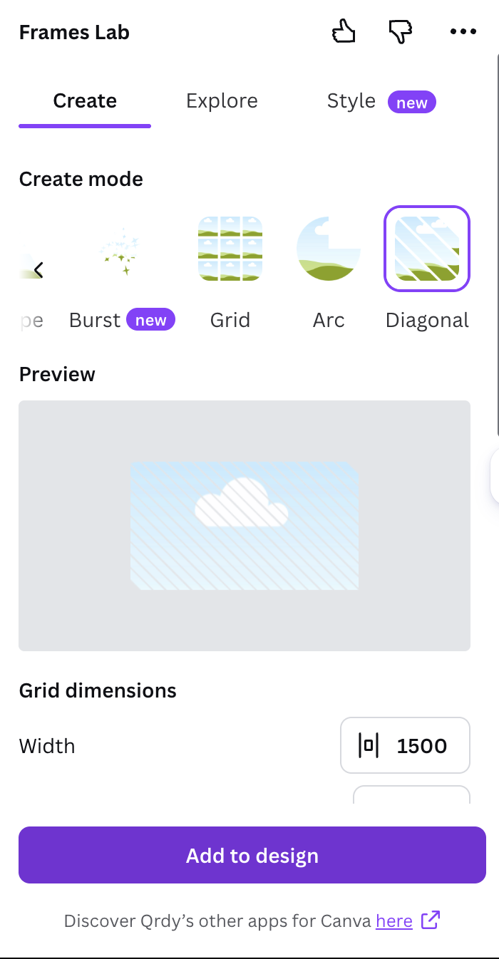
- Diagonal mode — spacing, gap and angle sliders. An angle around 20° gives the slanted split that reads as before/after in a fraction of a second.
- Grid mode — set columns, rows and gap; the Advanced panel adds rounded corners and lets you merge cells, so you can have one big hero panel plus two small ones.
- Arc mode — Pill degrees plus Start angle, for the arched crop.
- Burst mode — a starburst you can drop a number into for a "3 TOOLS" style badge. The controls (Style, Density, Size, Spread, Variation, Distribution) generate 2–10 previews at random, so click the one you like straight away; it will not come back.
At thumbnail size, stop at two or three panels. Grid and Diagonal will happily go to around thirty cells, and thirty cells at 168 pixels wide is noise.
Step 7 — Run the 168-pixel test #
This is the step that separates thumbnails that work from thumbnails that merely look nice:
- Zoom the Canva editor out to roughly 15%.
- Look away, look back, and read it in one second.
- If you cannot read the headline or tell what the subject is, the text is too small or the background is too busy.
- Export it and open it on your actual phone before you upload — laptop screens are flattering liars.
The usual fixes: make the headline about 30% bigger than feels right, cut one word, add the Border effect, or blur the background photo so the cut-out subject separates from it.
Step 8 — Export and upload #
Download as JPG (smaller) or PNG (sharper on flat colour), check it is under 2 MB, and upload it as a custom thumbnail. If you want a transparent-background PNG for something else, that checkbox is Canva Pro.
Step 9 — Make the next one take five minutes #
- Save the finished thumbnail as a Canva template and swap the photo and headline each time.
- Lock one palette across the channel. Color Harmony generates a harmonious set from a single brand colour — six harmony types — and applies it to the page in one click, which keeps a run of thumbnails looking like a series rather than a pile.
- Keep the headline in the same corner every time. Viewers learn where to look.
Which tool for which piece #
| Thumbnail element | Use | Why |
|---|---|---|
| Plain bold headline | Canva Text + Effects | Free, fast, mobile |
| Headline with footage inside the letters | Text to Frames | Canva has no native word-to-frames button |
| One image showing through a whole word | Clipping Mask | One image, one cut-out, done |
| Face or product inside your logo shape | Image to Frame | Turns any PNG/SVG into a real frame |
| Before / after split | Frames Lab, Diagonal mode | Angle and gap as numbers, not by eye |
| Starburst number badge | Frames Lab, Burst mode | Randomised, then drop text on top |
| Consistent colours across a series | Color Harmony | Palette applied to the whole page |
What Canva already does well #
Worth saying plainly, because installing apps you do not need is a waste of a sidebar:
- The YouTube Thumbnail page size is built in, and so are hundreds of editable thumbnail templates. If one fits your video, use it.
- Background Remover is the most valuable single feature on this list, and it is Canva's, not ours.
- Canva's own text Effects — Shadow, Lift, Hollow, Splice, Echo, Neon, Curve — cover most solid-colour headline treatments for free.
- Brand Kit stores your fonts and colours so the series stays consistent.
- The Canva mobile app handles native frames and templates fine. The frame-creating apps live in the desktop sidebar, so build the headline once on a laptop, then swap photos on your phone afterwards.
Five things that quietly ruin thumbnails #
- Text below about 90 px on a 1280 x 720 page. It disappears on mobile. Bigger than feels comfortable is usually correct.
- Photos inside thin letters. A busy image needs a heavy font; a light serif filled with a landscape reads as texture, not text.
- Something important in the bottom-right corner. The duration stamp covers it.
- Checking at 100% zoom only. Check at 15% too — that is the real viewing size.
- Restyling every video. One layout, one palette, swapped content. Recognition beats novelty.
Related reading #
Frequently asked questions
YouTube asks for 1280 x 720 pixels — a 16:9 rectangle, at least 640 pixels wide, saved as JPG, PNG or GIF and under 2 MB. In Canva, either search the YouTube Thumbnail template size or use Custom size and type 1280 x 720 px. Set that size before you add anything, because frames made by Canva apps scale themselves to whatever page is open.
No. A 1280 x 720 page, text, Elements shapes and free templates all work on a free account, and Text to Frames gives you five free fonts plus the Split into letters setting. You do hit Pro for two things people usually want: Background Remover, which is the fastest way to cut your face out of a busy shot, and the Blur / Border / Inner shadow effects in Text to Frames.
Yes. Text to Frames produces real Canva frames, and Canva frames accept video as well as stills — so you can drop a clip into each letter. That is useful for an animated intro or a Reel cover, but a YouTube thumbnail is a still image, so the frame will show whichever moment the video is paused on when you export.
Because the source file still had a background. Image to Frame traces the outline of the image you give it, so if the logo or icon sits on a white or coloured square, that square is the outline. Remove the background first and save as PNG or SVG — a JPG can never carry transparency, so it will always convert to a rectangle.
Related products


More from QRdy Blog
10 Ý tưởng quà Giáng sinh cho ông bà tự làm trong Canva (lịch ảnh, khung ảnh, thiệp)
10 ý tưởng quà Giáng sinh cho ông bà tự thiết kế trong Canva: lịch ảnh gia đình, khung ảnh hình trái tim, thiệp tên bằng ảnh các cháu, lịch đếm ngược. Rẻ, cá nhân hoá và in được ở nhà.
Word Calendar Template vs Canva Calendar Maker: Which Should You Use?
Microsoft Word calendar templates are fast and familiar; Canva's Calendar Maker app is built for good-looking, printable calendars. Here is an honest side-by-side, with a clear verdict for each use case.
The Best Canva Apps for Invitations (2026): Birthday, Baby Shower & Party
Canva's invitation templates get you 80% of the way. These Canva apps cover the rest: custom photo shapes, monogram letters, borders, palettes and RSVP QR codes.