
The Best Canva Apps for Instagram Carousels & Grid Posts (2026)
Carousels and grid puzzles are the two Instagram formats Canva makes you build by hand. These six Canva apps do the fiddly parts — splitting one image across slides, building even grids, filling letters with photos — so a ten-slide post takes minutes.
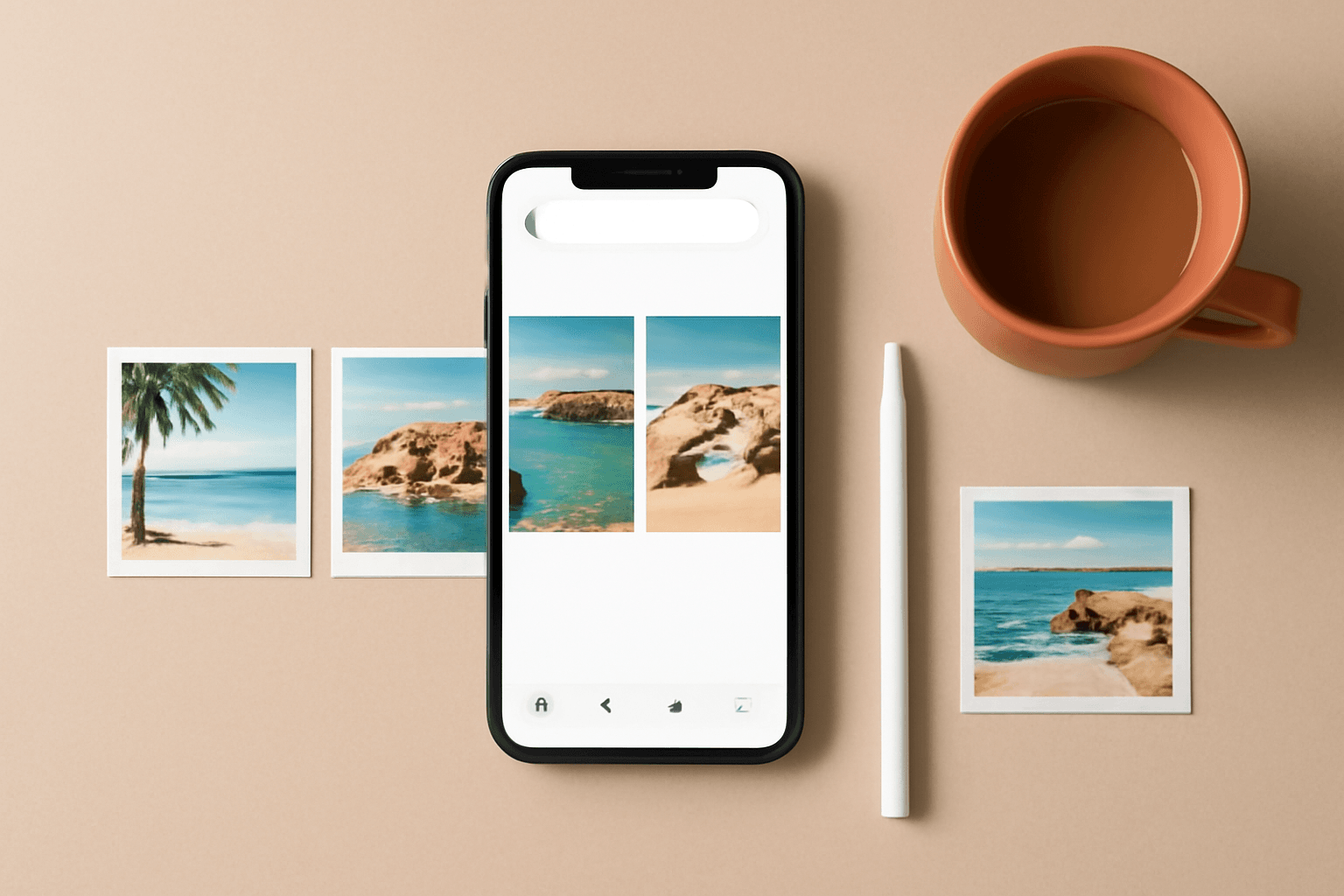
Instagram rewards two formats that Canva makes you build by hand: the carousel you swipe through, and the grid puzzle that only makes sense on your profile page. Both are just a set of squares with photos in them — and both fall apart the moment your gaps are uneven or your seams do not line up.
Canva has templates for both. What it does not have is a splitter, a grid generator, or any way to make ten slides share one look without you dragging rectangles around. That is the gap these six apps fill.
Here is what I actually reach for, ranked by how often it earns its place.
Quick pick #
| If you need… | Use | Why |
|---|---|---|
| One image split cleanly across slides | Frames Lab (Grid mode) | Set rows, columns and gap once; the cells come out identical |
| A carousel slide shaped like a heart, star or letter | Frame Collage | Toggle cells on a matrix until the lit ones form the shape |
| A cover slide where the headline holds photos | Text to Frames | Every character becomes its own frame |
| Your logo or a custom shape as a reusable window | Image to Frame | Upload a PNG/SVG/JPG, get a real Canva frame back |
| Ten slides that look like one set | Color Harmony | Generates a proper palette and applies it to the page |
| A shaped photo window in ten seconds | AI Frames | Describe it, or pull one from the free library |
1. Frames Lab — the one that does the splitting #
Frames Lab is the app doing the heavy lifting for both formats, which is why it is first.
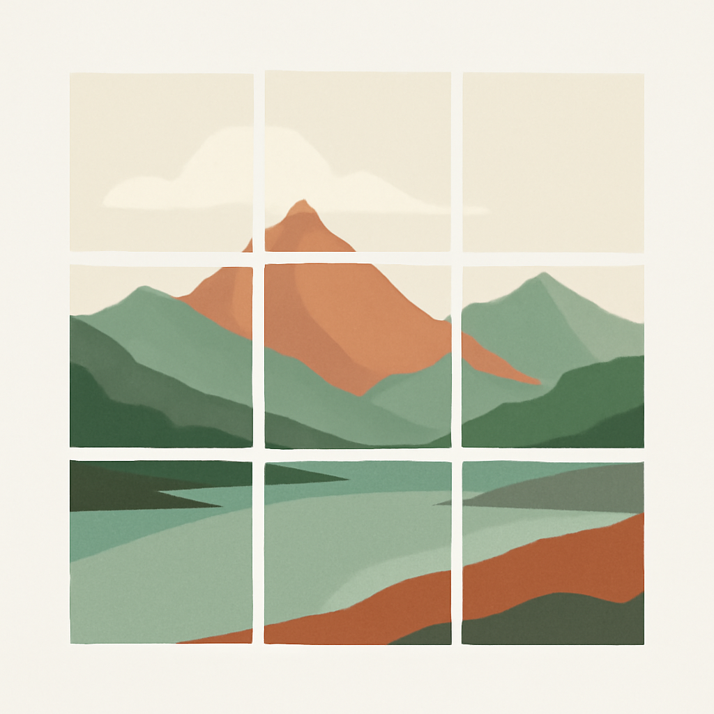
Open the Create tab and pick Grid mode. You set the dimensions, the number of columns and rows, and the gap between cells. The preview updates as you type, and the finished grid auto-scales to whatever page size you have open — so a 1080 x 1350 portrait slide and a 1080 x 1080 square slide both get a grid that fits without manual resizing.
Two settings matter more than the rest:
- Gap is what makes a grid puzzle read as a grid rather than a mush. Set it once and every cell inherits it.
- Merge into one block, under Advanced, fuses the cells so a single image spans the whole grid instead of nine separate photos. That is the seamless-split behaviour people go hunting for image splitter tools to get.
There is a ceiling: grids past roughly 30 cells get blocked, and heavy Wave distortion on top of a dense grid will trip it too. For a 3 x 3 or 3 x 6 Instagram layout you are nowhere near it.
The other modes earn carousel work as well. Arc builds a rounded-window cover slide (set Pill in degrees — 270 is a good arch — plus a Start angle). Burst generates radiating sunburst frames for a sale or announcement slide, with Density, Size, Spread, Variation and Distribution controls and 2–10 previews at a time; results are randomised, so grab the one you like immediately. Shape converts a shape already sitting in your design into a frame — add it from Elements → Shapes, then hit Recheck design.
The newer Style tab keeps your recently added frames and lets you re-add them with Blur, Border or Inner Shadow applied. Handy when slide 1 needs a glow and slides 2–10 do not.
Free accounts get a limited number of frame adds before an upgrade prompt appears.
2. Frame Collage — shaped slides, built like pixel art #
Frame Collage solves a narrower problem, but nothing else solves it as fast. You get a matrix — 8 x 8, 16 x 16, 24 x 24 or 32 x 32 — and you click cells on and off until the lit ones form a shape. A heart. A star. A letter. There are presets to start from, and you can set spacing and border colour.
When you apply it, every lit cell becomes its own Canva frame, so you drop a different photo into each one. That is how you get a "our year in 40 photos, arranged as a heart" slide without placing forty images by hand.
Use it for the payoff slide of a carousel. Use Frames Lab for the structural ones. They are not competitors — I wrote about where each one wins in more detail.
3. Text to Frames — cover slides that stop the scroll #
The first slide decides whether anyone swipes. Text to Frames turns a word into a row of frames, one per character, so "SUMMER" can hold six different photos instead of being flat coloured type.
Type your text, split it into letters, and each letter arrives as a droppable frame. There is a 200-character cap — go past it and you get a "Text is too long" message, which is fine because a cover headline should be three or four words anyway.
Two practical notes: keep the font heavy (thin letterforms leave no room for an image to read at phone size), and check the result at actual size before you commit. A photo-filled headline that looks great on a laptop can turn to noise on a 6-inch screen.

4. Image to Frame — your own shape, reusable #
If your brand has a mark, a badge or a signature silhouette, Image to Frame turns it into a real Canva frame you can drop photos into again and again across a whole carousel.
Upload a PNG, SVG or JPG under 5 MB and it comes back as a frame. The rules that trip people up:
- Remove the background first. PNG and SVG carry transparency; JPG never does. A JPG with a white background produces a rectangular frame, every time.
- SVG is the safest input — complex, tangled curves in a raster file can fail to convert.
- The border control (0–50) does not show in the preview. It renders only after you add the frame to your design, which looks like a bug and is not.
For a carousel this pays off on slide 2 onward: same shaped window, different photo, instant visual rhythm.
5. Color Harmony — the thing that makes ten slides look like one post #
This is the least glamorous pick and the one that changes carousels the most.
Color Harmony generates palettes from proper colour theory — complementary, analogous, triadic, tetradic, split-complementary, monochromatic — from a base colour you pick or a HEX you paste. Then it applies them to the page, so you are recolouring a whole slide rather than nudging individual elements.
Pick one palette, apply it across every slide, and a carousel reads as a deliberate set instead of ten designs that happened on the same afternoon. You can save a brand palette and reuse it next week.
6. AI Frames — the fast option #
When you just need a shaped photo window and do not want to think about parameters: describe the frame in words and AI Frames draws it, or pull one from its free library of 20,000+ frames, with shadow, border and effect options on top.
It is the low-effort sibling of Frames Lab. If you know exactly what geometry you want, use Frames Lab. If you want "something leafy" and are willing to browse, start here.
What Canva already does well #
Worth being straight about, because you may not need an app at all:
- Grids (Elements → Grids) give you basic even layouts for free, and they accept dropped photos. They are limited to Canva's preset arrangements, and you cannot dial a specific gap.
- Frames (Elements → Frames) covers circles, arches, hearts and hundreds of shapes with no install required.
- Background Remover on Pro is what you should run before feeding anything to Image to Frame.
- Instagram templates are genuinely good starting points, including puzzle-grid layouts.
- Magic Switch will resize a square carousel to portrait — useful, but check every slide afterwards, because text boxes shift.
The apps above are for the cases Canva's built-ins do not reach: exact gaps, seamless splits, arbitrary shapes, photo-filled type, and one palette across a set.
Sizes, before you build anything #
- 1080 x 1080 px (1:1 square) or 1080 x 1350 px (4:5 portrait). Portrait occupies more screen while someone scrolls, so it is the stronger default.
- Every slide in one carousel must be the same size. Mixing ratios makes Instagram crop unpredictably.
- For a grid puzzle, design one tall canvas first, then split it — do not design nine squares and hope they align.
- Keep anything important away from the outer ~60 px of each slide; profile-grid previews crop portrait posts to square.
A starter stack #
If you are picking two apps rather than six:
- Frames Lab for structure — grids, arcs, splits.
- Color Harmony for consistency across the set.
Add Text to Frames when your cover slides start feeling flat, and Frame Collage the first time you want a slide shaped like something.
Planning a month of posts rather than one? Calendar Maker builds the content-calendar slide, and there are ten more Instagram post ideas here if you need the concepts before the layout.
Before you publish #
- View every slide at phone size, not laptop size.
- Check the seams on a split image by placing the slides side by side one last time.
- Make sure slide 1 works alone — most people never swipe.
- Export at the size you designed; letting Instagram resize costs you sharpness on text.
Frequently asked questions
Two safe sizes: 1080 x 1080 px (square, 1:1) or 1080 x 1350 px (portrait, 4:5). Portrait takes up more of the screen as someone scrolls, so it is the better default for text-heavy carousels. The important rule is that every slide in one carousel uses the same size — mixing square and portrait slides makes Instagram crop them inconsistently.
Canva has no one-click image splitter. You can fake it by making a design several pages wide, dropping one large image across it, and exporting page by page — but lining the seams up by eye is where it usually goes wrong. Frames Lab's Grid mode is the shortcut: it builds evenly spaced cells with a gap you set once, so the cuts are identical every time.
A carousel is one post with several slides that people swipe through. A grid puzzle is several separate posts that only line up when someone looks at your profile page — usually a 3 x 3 or 3 x 6 block. Carousels are read left to right; grid puzzles are read top to bottom and get broken by every new post you publish afterwards.
All of them install free and let you try the main features. Frames Lab caps how many frames a free account can add before it prompts an upgrade, and Calendar Maker gates Add to design behind Pro. AI Frames has a large free frame library. Canva's own Grids, Frames and Background Remover cost nothing extra on a Canva Pro plan.
Related products


More from QRdy Blog

What Is a Monogram? Meaning, Styles, and How to Make a Photo Monogram in Canva
A monogram is a design built from one or more initials. Learn the definition, the classic three-letter order rule, the main styles, and how to make a photo-filled monogram in Canva with Text to Frames.
10 Ý tưởng quà Giáng sinh cho ông bà tự làm trong Canva (lịch ảnh, khung ảnh, thiệp)
10 ý tưởng quà Giáng sinh cho ông bà tự thiết kế trong Canva: lịch ảnh gia đình, khung ảnh hình trái tim, thiệp tên bằng ảnh các cháu, lịch đếm ngược. Rẻ, cá nhân hoá và in được ở nhà.
Word Calendar Template vs Canva Calendar Maker: Which Should You Use?
Microsoft Word calendar templates are fast and familiar; Canva's Calendar Maker app is built for good-looking, printable calendars. Here is an honest side-by-side, with a clear verdict for each use case.