
CMYK vs RGB: Which Color Mode Should You Use (and What Canva Actually Does)
RGB is light, CMYK is ink — and that one difference is why your print came back duller than the screen. Here's the plain-English comparison, plus exactly what to do about it inside Canva.
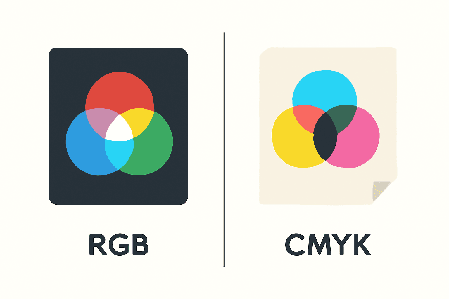
Every so often someone prints a design they loved on screen and the result comes back flat. The neon blue is now a dusty navy. The lime green went olive. Nothing went wrong in the file — the design just moved from one color model to another.
That's the whole story of CMYK vs RGB. Here's the short version, the honest version, and what it actually means when you're designing in Canva.
Quick answer #
| RGB | CMYK | |
|---|---|---|
| Stands for | Red, Green, Blue | Cyan, Magenta, Yellow, Key (black) |
| How it works | Additive — light is added to black | Subtractive — ink absorbs light from white paper |
| All channels at max | White | Muddy dark brown (why K/black ink exists) |
| Lives on | Screens, phones, projectors | Paper, cardstock, packaging |
| Color range | Wider — can hit neons and electric brights | Narrower — no true neon |
| File types | PNG, JPG, WebP, SVG, MP4 | PDF (print), TIFF, EPS |
| Use it for | Social posts, websites, digital planners, slides | Business cards, flyers, calendars, brochures, cards |
The one-line rule: if it will glow, RGB. If it will be held, CMYK — or at least designed with CMYK in mind.
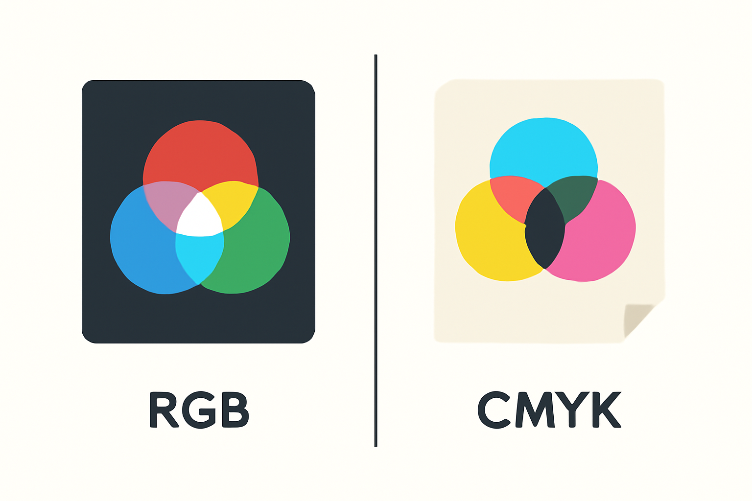
Why they behave so differently #
RGB is additive. A screen starts black and adds colored light. Add all three channels at full strength and you get white. That's why screen colors can be so intense — you're looking at a light source, not a reflection.
CMYK is subtractive. Paper starts white and ink removes wavelengths from the light bouncing off it. Cyan, magenta and yellow at full strength theoretically make black, but in practice they make a murky brown — which is exactly why printers carry a separate black (K) cartridge instead of mixing one.
So the two models aren't different dialects of the same language. They're doing opposite things.
The gamut problem, in one picture #
"Gamut" just means the range of colors a system can produce. RGB's gamut is bigger than CMYK's. There is no combination of four inks that reproduces a glowing neon cyan, because ink can't emit light.
When you send an RGB file to print, every out-of-gamut color gets pushed to the closest printable neighbor. The image doesn't break — it just gets quieter.
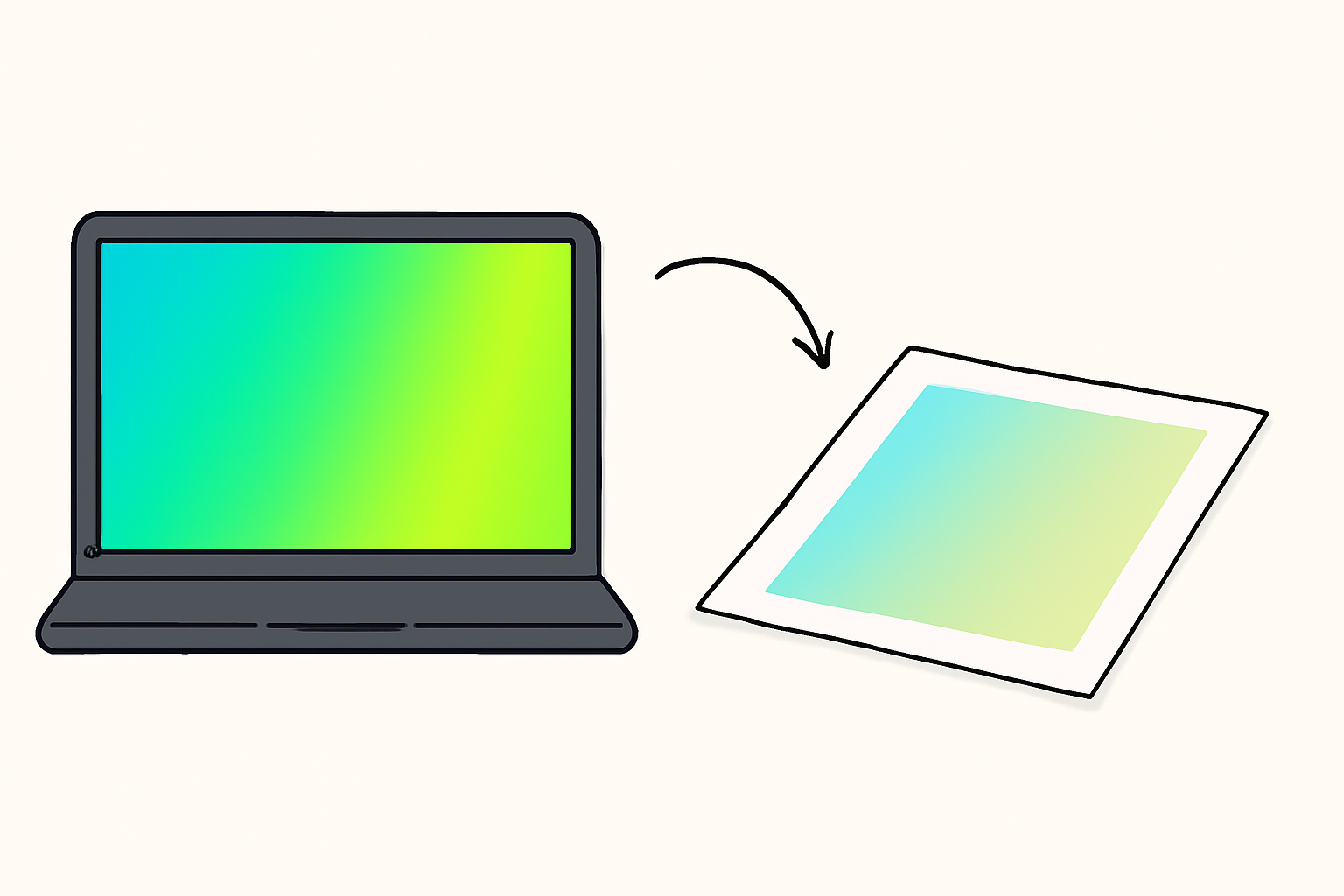
The colors that shift most:
- Neon and fluorescent anything
- Electric blues and vivid purples
- Saturated bright greens
- Very light pastels on the edge of white
- Deep rich blacks (a single-cartridge black prints greyer than you expect)
Colors that survive almost unchanged: warm neutrals, earth tones, muted sage, terracotta, cream, charcoal. That's not an accident — it's why "print-friendly palette" and "muted palette" tend to describe the same thing.
What Canva actually does #
This is the part people get wrong, so let's be specific.
Canva's editor is RGB. Every hex code you type, every color picker, every preview on your screen is RGB. There is no CMYK mode to switch into while designing.
Conversion happens at download. Choose Download → PDF Print, and Canva Pro exposes a color profile option: RGB or CMYK. Pick CMYK and Canva converts the file on export. If you download a PNG or JPG instead, it stays RGB — no exceptions.
Two honest caveats:
- Canva moves this option around between updates. If you don't see a color profile dropdown, expand the PDF Print settings; it's usually tucked under crop marks and bleed.
- You cannot preview the CMYK result inside Canva. There's no soft-proofing. What you see stays RGB until the file leaves.
Do you even need CMYK? Often not. Home inkjets, Canva Print, print-on-demand services and most online photo printers take RGB and run their own conversion — and their profiles are usually tuned better than a generic conversion would be. Commercial offset printers are the ones who'll ask for CMYK by name. The correct move is to ask your printer what they want before you export anything.
Designing so it prints well either way #
You get more from choosing better colors than from flipping a checkbox at the end.
- Sample from something physical. Photograph a paper swatch or fabric you like and pull the hex codes from that. Colors that already exist on a physical object are, by definition, printable.
- Build the palette once, apply it everywhere. Color Harmony generates complementary, triadic and analogous palettes and applies them across a whole template in one click — much easier than hand-checking twenty elements for a neon that slipped in.
- Don't rely on pure black. For large dark areas, a very dark charcoal often prints richer than 100% K alone.
- Test one page before you commit. Print a single sheet on the actual paper stock. Five minutes now beats 200 misprinted cards.
Where this bites hardest: calendars #
Calendars are the worst-case scenario for color drift, because they combine everything that shifts. A photo at the top, a colored header bar, alternating row fills, and a lot of small type — all on one page, all printed, and you're usually printing twelve of them.

If you build the grid by hand, changing the palette means editing every cell again. That's where Calendar Maker helps: you set the header text color, number color, header bar color and alternating cell colors once, watch them in the live preview, and generate the grid. It ships with 30+ built-in color presets, and if you turn on Add all months with Each month on its own page, all twelve pages inherit the same palette — so one print-safe decision propagates through the entire calendar instead of twelve separate ones.
You can also save the setup. Next time you print, restore the palette that worked rather than rediscovering it.
The same logic applies to photo-heavy pieces: Image to Frame and Frames Lab let you drop photos into custom shapes, and photographs generally convert to CMYK gracefully. It's the flat vector fills behind them that need watching.
The verdict #
Use RGB for anything that stays on a screen — Instagram, websites, digital planners, presentations, PDFs people read on a laptop. You'd be throwing away color range for no reason.
Use CMYK when a commercial printer asks for it. Export via PDF Print with the CMYK profile, and accept that the brightest colors will soften.
For everything in between — home printing, Canva Print, print-on-demand — send RGB, let the printer convert, and do the real work earlier: pick a palette that doesn't depend on colors ink can't make. A muted, considered palette prints beautifully in either mode. A neon one will disappoint you in exactly one of them.
Frequently asked questions
Canva's editor is RGB. Every color picker, hex code and preview you see while designing is screen color. Conversion to CMYK only happens at download time, if you choose the PDF Print option and pick the CMYK color profile (a Canva Pro feature). If you download a PNG or JPG, it stays RGB.
Not always. Home inkjets, print-on-demand sites and most online photo printers accept RGB files and do the conversion themselves — often better than you would. You only need to supply CMYK when a commercial offset printer explicitly asks for it. Ask your printer first rather than guessing.
Because a screen emits light and paper reflects it. Bright neons, electric blues and saturated greens sit outside the range ink can reproduce, so they get mapped to the nearest printable color — which always looks softer. Nothing is broken; it's a physical limit of ink on paper.
Related products


More from QRdy Blog
10 Thanksgiving Design Ideas You Can Make in Canva (Printable Decor, Menus & More)
Ten Thanksgiving projects you can actually design and print at home this year — turkey-shaped photo frames, a "GRATEFUL" photo banner, menu cards, a Friendsgiving invite, a November countdown and more. Each one names the Canva app that does the hard part.
The Best Canva Apps for Photo Books & Photo Albums (2026)
A photo book is 40 pages of the same three layouts unless you give yourself better tools. These are the Canva apps that actually speed up building a photo book or album — grid spreads, custom-shape pages, a photo-filled cover — plus what Canva already does well on its own.
How to Make Photo Ornaments in Canva (Print at Home, Any Shape)
A print-at-home photo ornament is one shape, one photo and one punched hole. Here is the full Canva workflow — page size first, custom shapes into real frames, a full sheet laid out at once, and the print settings that stop you reprinting.